Crafting the Next.js Website
April 2023
In February 2023, together with @glennui and @almonk we started building a new website for Next.js. On the surface, the design made by Glenn seemed really simple, but with plenty of opportunity for delight and subtle animations. Personally, I found the design to be a breath of fresh air: no swanky mesh gradients, obnoxious artifical shines, or overuse of gimmicks. A pure masterclass in subtle craft where the intricate details almost fade into the background.
This project also started at a time when I was taking a pause from side projects. Coincidentally, whilst working on this I felt my creative cup being filled by my dayjob, not side projects. The creative freedom and the degree of challenge combined with a deadline far beyond the horizon was the perfect "creative workcation", if you will.
Another thing that we enjoyed as a team was breaking the design up into chunks. Not very systematically from the get-go, but mostly intuitively as we went along. We had big ambitions for the page, but instead of dragging an already massive pull request out, we shipped the static version as soon as it was an improvement over what was already in production. Animations and adjustments to other surfaces could follow up later.
In no particular order, we'll break down a couple of implementation details, some of which may be less trivial than others, but all of them were stimulating to build.
Grid Lines
One of the first details you'll notice on the hero are container grid lines. They are absolutely positioned pseudo elements and are flexible based on the inner content and different screen sizes.
I borrowed a technique from Stripe for these. By using a repeating linear gradient to create a dotted line we can control the dots more precisely compared to a dotted border property. We can also fade out the edges on the same element with a mask.
Blinking Switchboard
The grid of cards features a switchboard animation. On hover, the lights spell out "NEXT":
Initially, this was a vector illustration, but the rendering wasn't consistent across browsers so I built it in code:
The light glow is a CSS shadow. However, the only properties being animated are opacity and transform. Animating box-shadow would not be ideal since it would trigger a browser re-paint on every frame of the animation. Likely not to be a problem on modern computers, but older, less powerful devices, like smartphones, may drop frames and make the motion look sluggish.
Instead, we toggle the opacity of pseudo elements with a shadow:
The hover effect is basically the same idea: an array of cherry-picked indices to spell out "NEXT" and then on hover the lights are replaced sequentially.
Focus States
Consistent focus styles are rare to come across on the Web. Even the best of the best sometimes miss here. And I'm not just talking about the lack of focus states. Pick any website and try to tab through it. You'll find focus states in different color and shapes. Most of them would likely show you the default native one, matching your OS theme color. And a few components might implement a custom focus state.
The Discord web app is one of the best examples of consistent focus states. They always have a custom blue color, matching the radius of the trigger element, perfectly offset from the content with enough padding. Even elements that don't have a background color, like links, will have a radius when focused. As a bonus, focus rings aren't clipped when overflowing a container.
Admittely, for a single page it's not that difficult to consistently style focus states. The complexity comes from having to cover a large surface area with multiple pages and components being worked on and shared by different teams. However, there are a few curious details here for nicer focus rings. For example, I prefer to create focus rings with a shadow:
The first shadow would create padding around the element, and the second would then offset and display a 2px outline. This does assume that the element always appears on top of app background color, but I've found this to be barely noticeable even if that's not the case.
We could technically do this with outline and outline-offset but in Safari the outline would not adhere radius of the element. Safari 16.4 does now have support for it, but since the updates are tied to the macOS version, it may still be early to rely on it.
Another neat trick is to set a slight radius, padding, and negative margin to offset the padding, for focusable elements like links. It makes the focus state a bit more pleasing even if the radius won't display until focused.
On the right is an example of this treatment being applied:
Serif Quote Marks
I remember first seeing this on the Radix UI website. Instead of using Inter's quote marks, we render them using Georgia as the font family for that little bit of finesse.
To offset the quote mark from the first line and make sure each text row is vertically aligned, text-indent: -0.4em was also applied thanks to Shu.
Explicit Accessibility Labelling
It's obvious enough to include alternative text for images and videos but sometimes we might build illustrations with HTML and CSS. Most of the time screen reader output is not ideal: the user has to go through multiple elements and still might not get the full gist of what's actually being displayed on the screen:
Instead, we can set aria-hidden on the inner HTML, and write a custom aria-label for the whole group. This way the user only has to navigate to a single element, and gets a more descriptive idea of the element itself. Thanks to Adrian for catching this!
Styling Data Attributes
A tiny code habit I picked up from this project was to make more use of data attributes for styling. For example, traditionally I would map variants to class names like so:
Instead, why not just pass the variant to a custom data-variant attribute:
And then style it with CSS:
Fluid Typography
On the hero, the title and subtitle adjust much more fluidly compared to fixed font size values at specific breakpoints.
I used to always adjust typography at manual breakpoints. Until now, I never tried using the CSS clamp function. It helps to responsively adjust any property between a minimum and maximum value:
Gradient Tracing
Another animation on the website is a bunch of connecting lines forming into a CPU in the center. I was delighted to see this come together so well thanks to help from Paco and Jonnie. It's not exactly the most straightforward thing to figure out, at least for me. I tried using CSS Motion Path with promising results but it didn't quite work when the path was curved.
I landed on animating the x1, x2 and y1, y2 values on a <linearGradient /> element. The gradient is then used as a stroke on a <path /> element.
Let's try breaking down an example. There are two duplicate paths on top of each other:
The gradient has a fade into the primary color near the very top to create a partial gradient on the whole path. Followed by a fully opaque gradient stop, and then fade out again to the bottom. This is what the gradient definition looks like in Figma:
We can set the y1 value to the height of the <svg> node and move the starting point to the bottom edge. And we want to make the y2 twice the height so the tail of the gradient is offset. This way the gradient will gracefully reveal itself once animated.
You can't see anything, but the head of the gradient is now exactly at the starting point. To move it upwards by 40px, we can just adjust the y1 and y2 values:
Next, I used React and framer-motion to animate the gradient coordinates. Any UI framework with a motion library that can interpolate between two values would work.
Feel free to play around with the animate values. This formula is not generic and different variations may need some fine-tuning by hand to nail the velocity and timing.
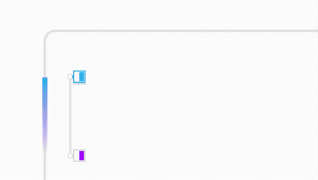
To understand how the gradient is moving, here's a lil helpful visualization, courtesy of Paco:
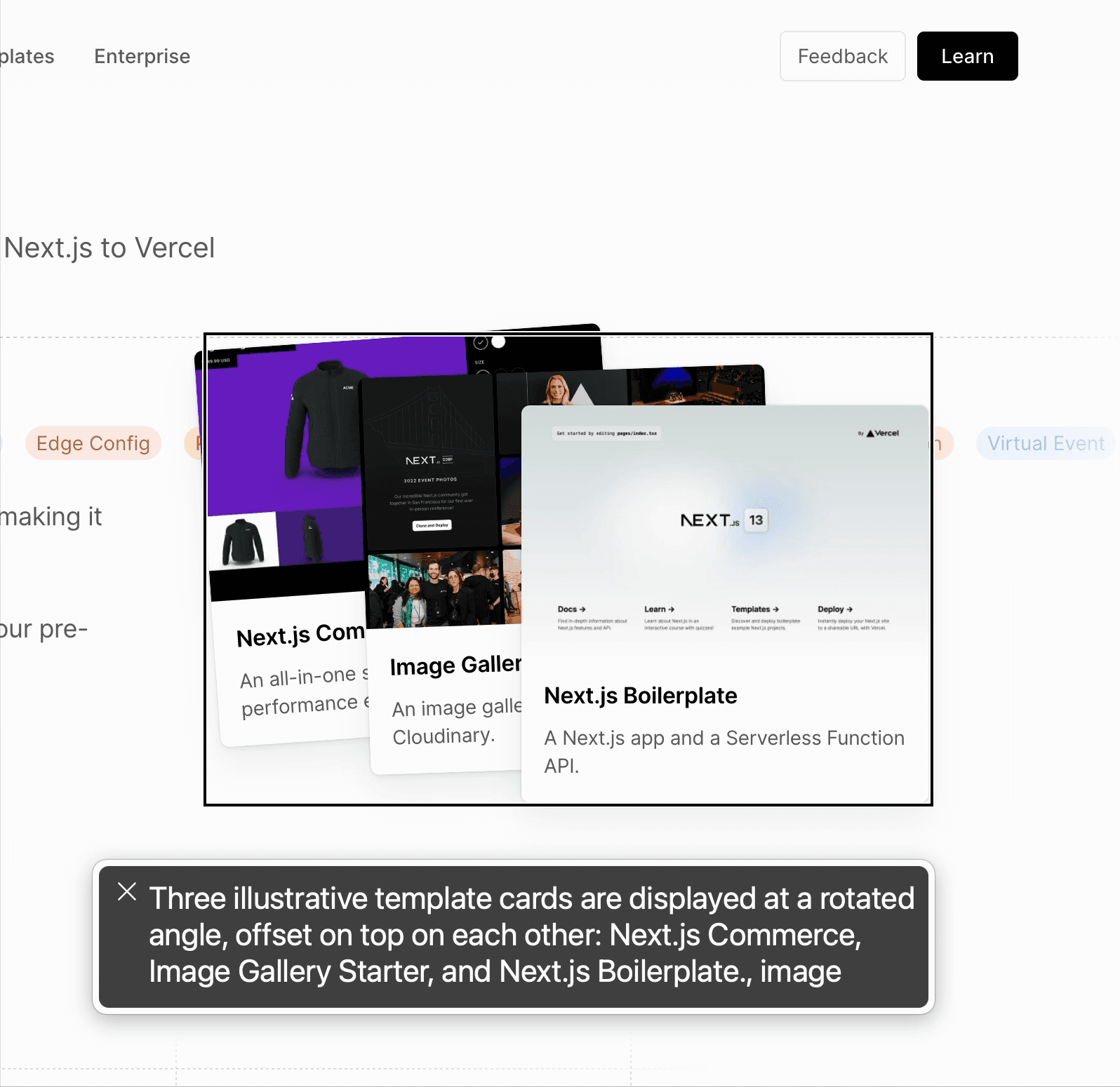
Card Illustrations
Lastly, many of the ideas from above (masking, gradient tracing, random delays) are used to also animate illustrations built with CSS:
I did briefly have some trouble making the lines fade out smoothly. A simple opacity fade was not ideal since the line would then feel like it came to a full stop all at once. In the end, I masked the SVG elements with a CSS gradient to make them smoothly fade out into the edges of the window.
This one was fairly straightforward to make. Windows are created with CSS and the dots on each scatter then randomly fade in with JavaScript. On hover, similarly to the switchboard, we randomly toggle the opacity of each dot.
Acknowledgments
Kudos to Glenn, Emil, Al, Paco, Jonnie for all their help and direction!
No artificial intelligence was used in the making of this project.