What will you ship?
December 2023

In October, together with Glenn, Henry, and Alasdair, we shipped a new homepage for Vercel. Our north stars for the design were performance, constraint in visual flair, and opportunity for bridging different pages aesthetically. Yet, I wouldn't describe the page as minimal as we made use of different motifs like grid lines and pixelation, but rather an exercise in constraint and tranquil beauty. For instance, if an animation or interaction didn't perform well, felt pompous, or out of rhythm relative to the page, we didn't build it.
We anticipate conceptually trivial elements of an interface to gratuitously entertain and afford us with yet another masterpiece of an interaction. Naturally, we celebrate the minutiae of visual finesse to a degree that folks outside the rabbit hole don't relate as intensely to.
But what elements of an interface are largely universally experienced? The page speed, legible typography, information honesty, layout stability and scannability, accessible focus states, auditory feedback, and sensible DOM ordering. Alas, primitives such as performance and accessibility are not as glamorous or fruitful to obsess over — because seemingly, they are invisible, and thus are trivial to trade off when it comes to shipping quickly. Truthfully, I would much rather spend time on polishing that animation spring over tracking down what made the initial load so slow. But is having a slow website with immaculate attention to visual craft desirable?
We are proud to have struck a balance in shipping a website that feels reflective of our collective taste, yet doesn't nervously exhibit itself through artificial gimmicks. In this essay, we'd like to share said taste, convictions, and some technical implementation details.
Aesthetic Foundation
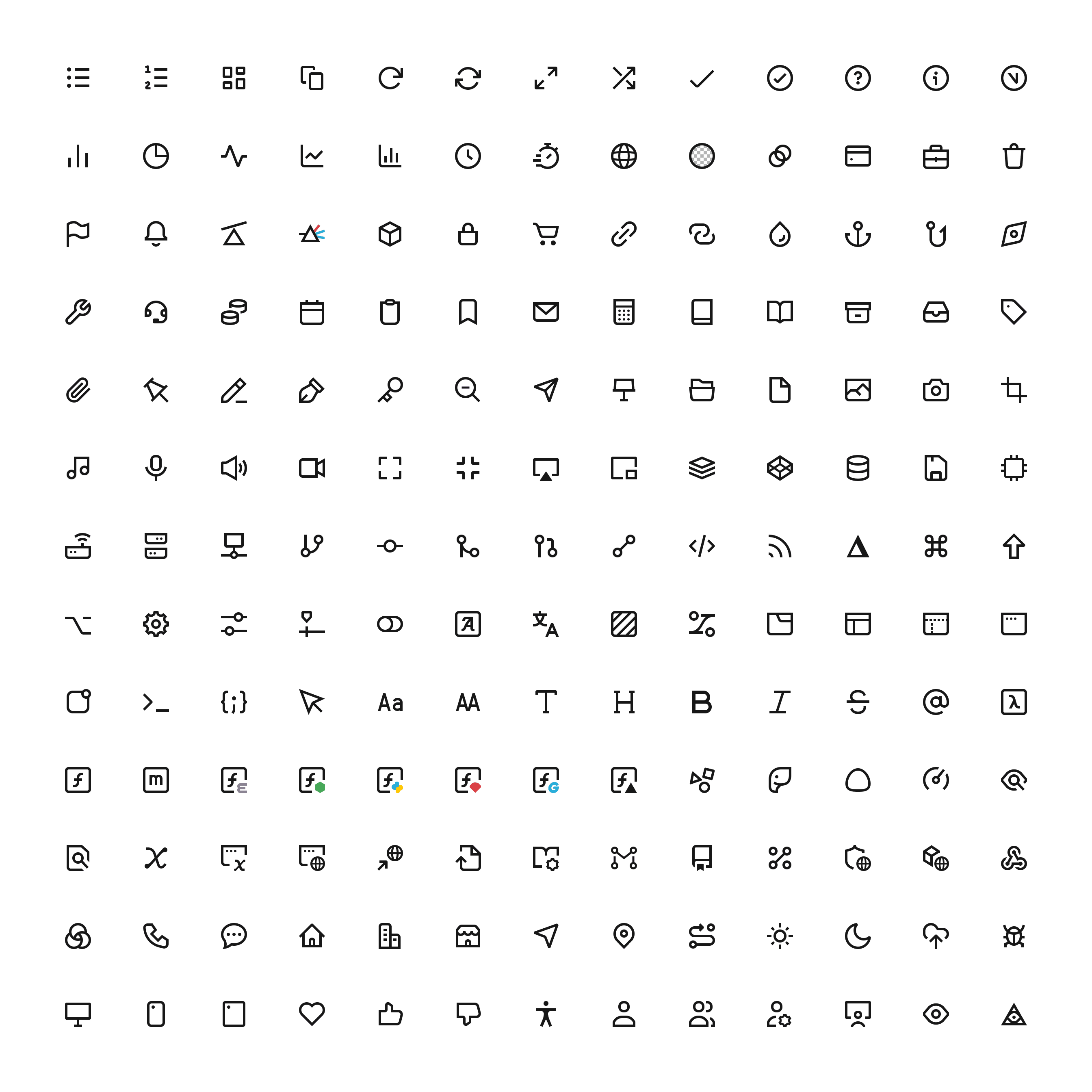
The new homepage is a sum of many parts. This year, Basement created our own typeface family. The goal was for beautiful, Swiss inspired design with optimisation for displays; chiefly to be used on our interface, documentation and code blocks. Icons are a often a precursor to text, so we also designed our own iconography set to pair with it. Add in a significant upgrade of our design system to supply us a wealth of new interface solutions, and there were three new common components to roll out across the site.
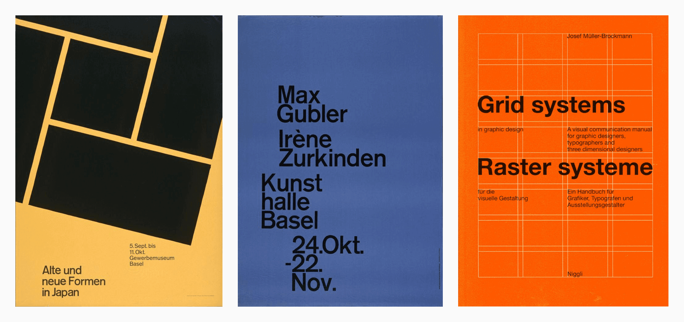
It felt apt to use these and chart ourselves new territory at the same time. What would pair best with a Grotesque sans-serif? We looked at the history of the Swiss design movement and fell in love with the raw exposure to the creation of design; blocks, grids, modularity. At its core Vercel is an infrastructure for frameworks, so the metaphor of showing a literal frame on every page became a hallmark to rally around.
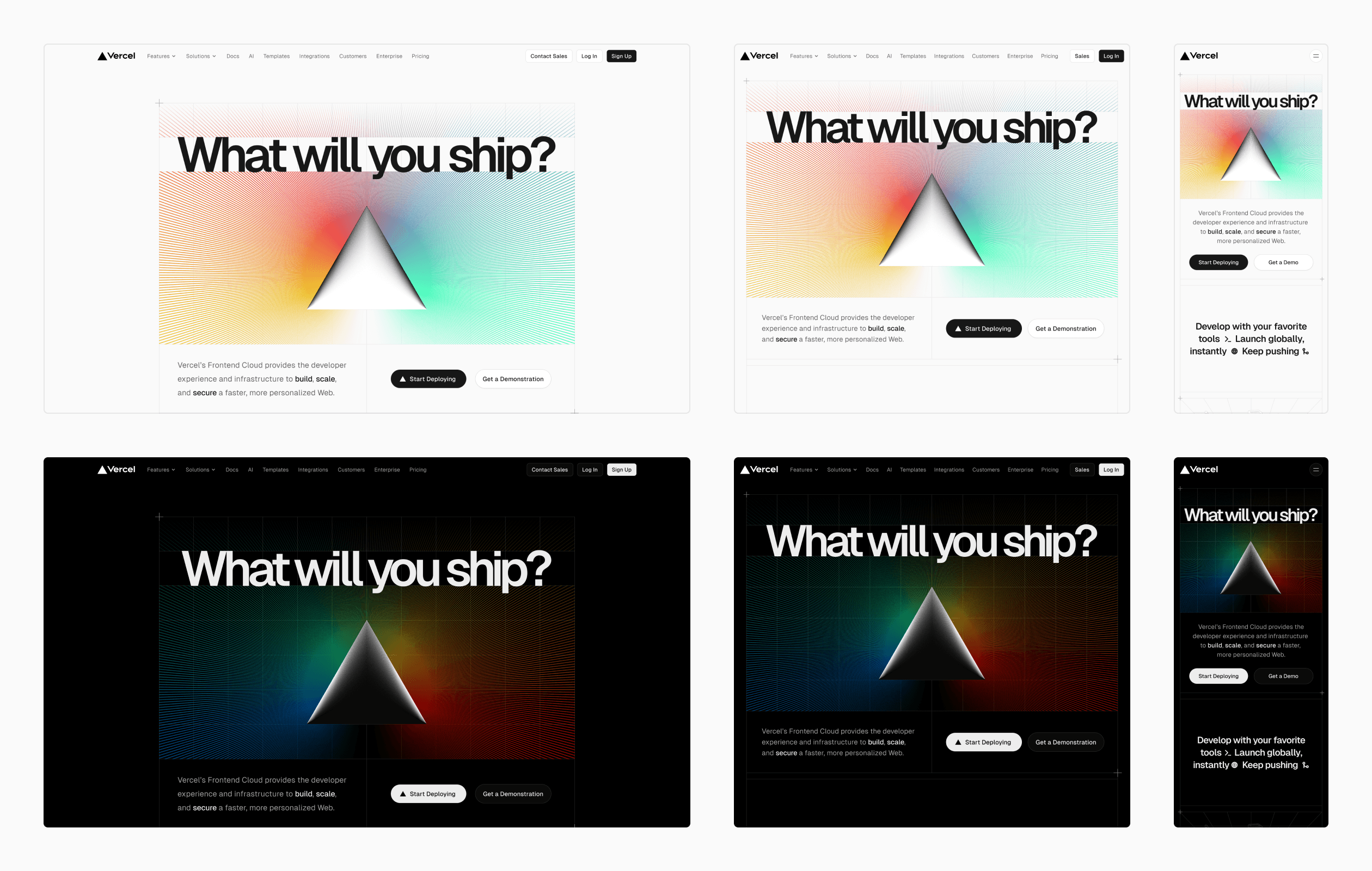
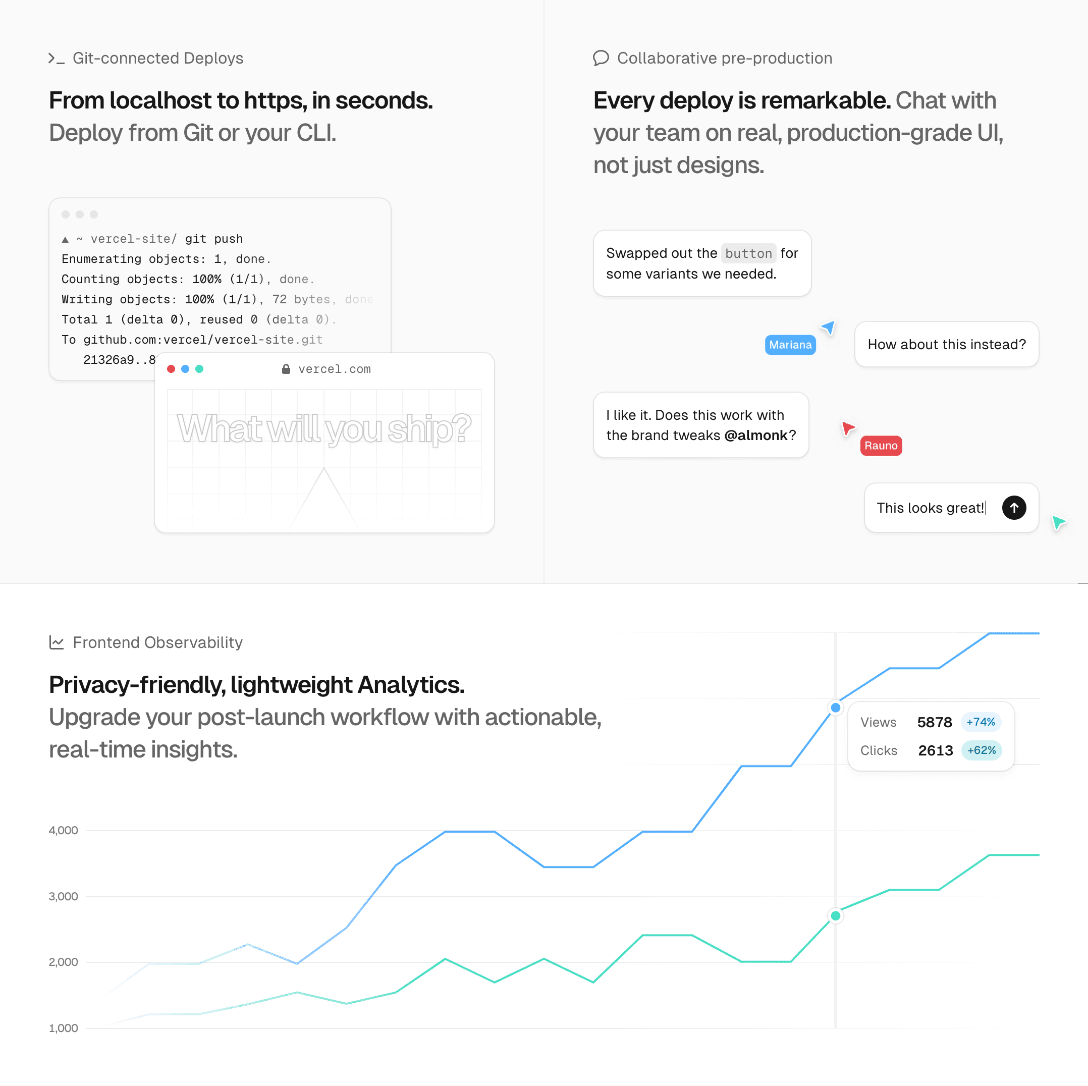
At the same time, Vercel is about speed. Having a consistent grid position across all pages as a user navigates through helps the user see what content swaps out, and how quickly. It lessens the appearance of a pseudo “layout shift” happening between views, and highlights incredible performance of server rendering. With this in mind, we dabbled with a set of early ideas about how the “hero” could capture this rigidity but still allow creativity. The pitch to @rauchg ended up being a series of ideas that will come to life in the following months:
What came out of this ideation is a signature hero, and set of columns to act as content guides for the rest of the page. To help guide the eye at certain points, we opted for crosshairs inspired by traditonal print center marks. At 1080 wide, the grid also helps each column of 360 have a readable line-length for 14-16px text. Given the modularity of everything being a block, it also collapses nicely into mobile. This empowers our design and engineering teams to roll out pages with a strong identity, consistency and speed.
Combined with the slightly curious prompt of "What will you ship?", we related to representing the full spectrum of the color wheel in the hero gradient as a metaphor for creativity.
As the design of this project commenced directly after @rauchg's Figma Config 2023 talk, we also made use of Figma’s new variables feature throughout the entire system. This meant content div sizing, column sizing, inner paddings, and margins between sections were all set up to adapt when dragged between desktop, tablet and mobile size classes.
Color variables are also rife throughout — we adopted @kevvy's new Vercel color system, optimized for accessibility, as color variables. With these new tools, the entire team can see pages adapted to dark mode at different sizes in seconds, rather than minutes.
Grid System
After the initial designs were signed off we very quickly recognized the pivotal role of the grid and knew its foundation would be a key to our success. It was imperative for us to craft a grid system that seamlessly combined performance, responsiveness, and a strong DX while offering a suite of out of the box defaults to cater to common layout needs. We wanted to create a grid system component that could be used to build out entire pages of grid based layouts:
The actual implementation of this component turned out to be anything but straight forward. The first significant hurdle emerged when it came to a crucial design element of the grid—drawing grid lines. Drawing guides even for a simple grid is an incredibly non-trivial task. The most common method involves bordering every child in the grid on two adjacent perpendicular sides, such as the right and bottom sides. Assuming every cell in the grid is filled, the result will have properly drawn guides but will lack the top and left borders on the grid itself. To address this issue, we can simply add a top and left border on the grid and voila, we have a grid with guides.
For simple grids, this method works well. However, it quickly falls apart as soon as you begin to stray away from this basic model. For example, a major drawback of this method is that it requires every cell to be filled in the grid. For the above grid the markdown looks like this:
We don't always want to explicitly define and fill each cell with content. The grid component already knows how many rows and columns we want from props, so it should just render the guides regardless of how many cells are actually given as children. So how can we draw guides around non-existent cells and ensure proper behavior when cells extend across multiple rows or columns?
Faced with this challenge, I eventually stumbled my way across a CSS property that is incredibly useful for this exact circumstance: display: contents. After learning about this property it really felt like I had discovered a hidden gem. This property causes an element's children to appear as if they were direct children of the element's parent, ignoring the element itself. You might be wondering why this is so useful, so let's work through how we can implement a React component that generates the guides for a grid given a set of rows and columns. First lets define the skeleton of our component:
We know that there are 3 main parts at play here. The parent grid element, the children of the grid, and the grid guides. The first step is to create the parent grid element and pass along our rows and columns as CSS variables:
Next, we need to render the grid guides. We can do this by creating a div with a class of grid-guides and rendering it as a direct child of the grid. Inside of this div, we will want to create rows * columns number of elements to fill our grid. Lastly, we just need to applyposition: relative to the grid class, and display: contents property to the grid-guides class. This will render the children of the grid-guides div as if they were direct children of the grid. However to ensure that these children don't interfere with the actual children on the grid, we need to apply a position: absolute and inset: 0px to every guide cell.
And with that, our basic component is done! Notice how we no longer need to define any cells to receive guides. Let's see what it looks like in practice. Feel free to edit the number of columns or rows:
Now that we have our main Grid component done, we can move onto creating a simple React abstraction for grid cells. Take a look at the following:
This component is incredibly simple, but it allows us to easily render arbitrary JSX inside a cell on the grid by specifying the row and column of the cell and that is it!
One very cool thing to note here is that passing the "auto" prop as a row/column is working here. If we were not using display: contents on our guides, setting "auto" as a row/column would break the grid entirely.
Another component to use with the grid is a cross which has the same API as the cell—you specify the row and column for which the cross appears:
Because the crosses are simply absolutely positioned relative to the specificed cell, they can be placed not only on the edges of the grid, but on any column and row combination:
At it's core, this is how we constructed our grid component for use on all our websites. Hopefully one could see how this component could be extended to support more advanced features such as cells that span multiple rows or columns, or responsive behaviors, i.e. setting the rows and columns to different values at different breakpoints. Additionally, this component and solution can be entirely server rendered since the component doesn't rely on client-side API-s at all.
Hero Composition
The hero visual is composed of multiple stacked layers of CSS, SVG, and progressively a shader. It does not rely on any client side code to display the essence of it, such as rendering a canvas element. The reason why this is important is to have a fast initial paint on the screen for something so crucial and center stage.
In descending order, the layer stacking order looks something like this:
- Heading
- SVG triangle
- CSS grid lines
- SVG rays
- CSS rainbow gradient
- GLSL shader
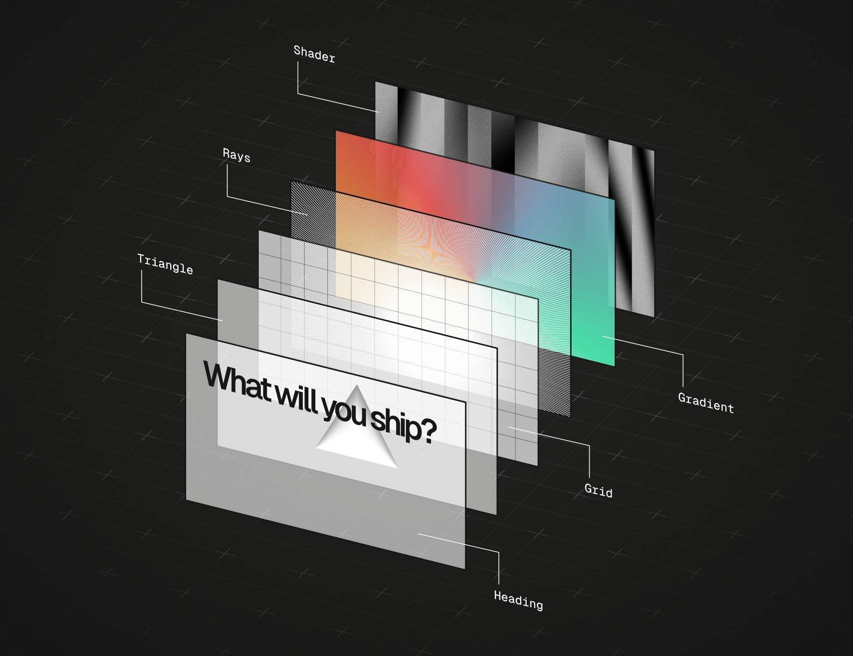
With layering we can progressively enhance the hero with a GLSL shader that gracefully fades in after the page has loaded. The async nature of the shader also allows us to code split it, perform light hardware detection to not render it at all on low powered devices while still retaining the core of the visual.
Visual Rhythm
Using an accent color for call-to-action buttons and other important elements has become an industry standard. If every element made repetitive use of a strong accent color, the color would no longer feel as significant.
For a consistent rhythm, we not only made deliberate effort not to overuse the grid and cross aesthetic. Subconsciously, we also made use of white space for a consistent rhythm in animation. When every element on a given section is signalling itself as novel or attractive, the novelty is diminished.
For example, consider this map of highlighted sections that either respond with motion to input or move independently. Orange sections signal high novelty, like the graph tooltip animating a long distance or icons pixelating on hover. Blue sections represent low novelty micro-animations like floating cursors or scaling icons on hover.
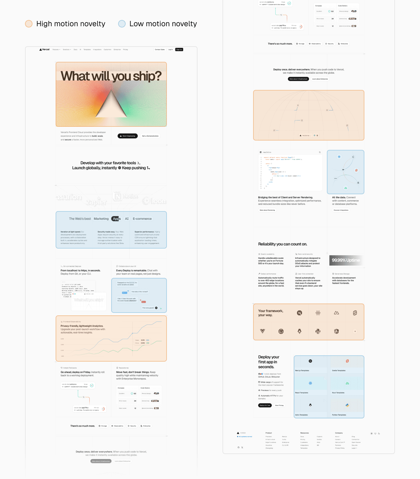
Scrolling through the page creates a consistent pattern of featuring an interlude following each animation segment. In this graphic, high novelty animations never appear consecutively between sections, but may be paired with lower novelty animations.
Pixelated Iconography
One of the most beloved parts of the home page were the pixelated icons. They are drawn in Figma, and extracted with a Ruby script that takes bitmaps as input, reads the pixel color at set intervals, and then creates a matrix for each icon (source). One of the matrices would look like this in code. Can you tell what framework logo this is for?
The fact that we have icons available as pixel data means we can render them in different formats.
For example, on the home page we render a canvas element for a smaller DOM footprint and animation. As a fallback, we make use of a base64 string to display a placeholder image which ends up costing merely ~1kb per icon. Optionally, the icon can also render as SVG for when they are above the fold.


The approach to rendering based on the matrix is pretty much the same between formats. For instance, the way we render them in canvas is by iterating over each row and pixel, and drawing a circle with arc() for a given coordinate:
The rendering happens very fast but to illustrate what's happening we can slow rendering down. And funnily enough, it kind of reminds me of an old computer monitor painting each frame painstakingly slowly:
And of course, we treat the icons as images so they recieve an aria-label for proper semantics and screen readers:
Accessible Code Blocks
We invested a lot of care into accessibility and went over the page with VoiceOver dozens of times to make sure we design the website for everyone as best as we could. VoiceOver is a screen reader that helps folks with visual impairements to understand the page and receive auditory feedback of text, images, and any other elements on a given page.
On the home page, we display a block of code. We had a component from our design system to pull in for this. Though, navigating the section together with @johnphamous we found that the experience could be more deliberate.
A couple of issues that surfaced were:
- The file icon is non-descriptive, it just says "image"
- The copy button does not audibly describe it's purpose nor provide feedback on press
- The line numbers are road blocks of noise and can be confused with being part of the code
Most of the fixes were trivial: we could hide the icon with aria-hidden since the file name already includes the file type. And place an aria-label on the copy button.
On copying the code, we also want to make sure to provide auditory feedback that the code indeed was successfully copied. We can use ARIA live regions to expose dynamic content changes to screen readers. In this case, we want to conditionally render a message:
Since the block of code on the given page is complementary, we can also make the tag into an aside, and give it a label that describes what the code does at a high level. This way someone could decide to either skip the section or dive deeper:
The line numbers are self-incrementing pseudo elements. Here's a quick example:
Now, since there's no DOM element rendered we can't just throw aria-hidden on it. Instead, theres a second value for content which is alternative text for pseudo elements. By setting the content to an empty string we effectively are saying that nothing should be announced for this element:
When all of these improvements are combined, we end up receiving more information from a screen reader. And not only for a single page, but for every piece of code that we present as the component powers hundreds of examples.
Code Driven Visuals
All of the supplementary visuals on the website are built in code without external libraries. We felt that using images is simpler in the short term, but we would get pristine quality, granular control, and true responsiveness by investing upfront into building marketing visuals as React components. We also make use of the same visuals across different pages so being able to drop one in anywhere is clutch.
To be deliberate we make sure to explicitly label visuals to separate illustrative elements from interactive ones. To do so, we treat the visuals as images and label them with a description that describes just enough relevant detail:
I mentioned responsiveness earlier. Since CSS container queries are now stable in modern browsers, we can build truly independently dynamic widgets instead of relying on the window width which is not reflective of how much space a component really has to display itself.
Container queries are really easy to use. We define a containment context on the root element and make any adjustments to the children based on the container size:
Now it's safe to render the component inside any container and predictably assume it will always display the ideal form:
requires a larger screen width.
Orbit Rings
One of the animations on the website shows 3 orbit rings intersecting with icons moving along the rings. There's a really neat CSS property available called offset-path that helps translate any arbitrary element on a given path.
What I didn't realise was that the value of this property does not only have to be a SVG path — it can also be its containing bounding box. By setting offset-path to content-box the element will not only use the parent as its trajectory — it will additionally respect the radius of the parent element.
Here's a tiny example of this property in action:
As of 2023, sadly content-box does not produce desirable results in Safari and Firefox. However, since 12/12 Safari 17.2 has now updated their offset-path implementation! I can confirm that using offset-path: content-box works well.
Alternatively, we could also provide circle() as a value for a similar result but likewise, this does not have cross-browser support yet.
The only workaround I found meanwhile works well for circular trajectories. Basically we can construct a circle as a SVG path from a given size (200px):
To make it dynamic, we can create this from a React component that takes a size prop.
Reduced Motion
Animations on the home page will also respect reduced motion, where applicable. Looping complimentary animations get special treatment on the page, and are paused. Interactions are explicit inputs which we don't intentionally reduce since none of them produce any extravagant, amplified effects or movement.
A good example where we can pause is this looping cursor and caret animation:
These are animated with CSS keyframes and we can pause them gracefully by using the animation-play-state property, instead of abruptly interrupting the animation by setting it to none.
And finally, a detail that no one sane has any reason to ever notice—we can make sure that the caret blink does not pause in a state where it becomes invisible.
Cinematography
For showcasing our work I shot a video and a few stills for use in media or our portfolios. One of them includes practical cinematography of the design. I don't have a lot of sage, creative wisdom to share here how to make a video like this, as I was learning myself while making. It's mostly a painful, repetitive process between shooting, editing, re-shooting and editing again. In the end, I am still not completely happy with it.
I used the Sony A7 III, and Tamron 28-75mm for the lens. Most of the shots were shot handheld with a slow motion setting on the camera. This makes jitter less noticeable, especially when combined with Final Cut Pro's stabilization. I also found it helpful to try and not move the camera with your hands so much, but more so your entire body as if the camera was a part of it.
The camera captures the display of a iPad Pro where the website runs on localhost for any modifications. Sometimes I would remove certain elements for a better scene, like while filming the grid.
I did not capture the website through Safari. Instead, to get rid of the chrome of Safari, two meta tags were useful to add the website in stand-alone mode to the home screen:
For stills, I got good results with long-exposure photography which made for some really cool overlaying visuals when capturing interactions:

Acknowledgments
In no particular order, kudos to everyone else who contributed to the 2023 Vercel Homepage:
- Alasdair Monk
- Elliot Johnson
- Emil Kowalski
- Evil Rabbit
- Genny Davila
- Greta Workman
- Guillermo Rauch
- Hannah Gates
- John Phamous
- Lee Robinson
- Morgane Palomares
- Peri Langlois
- Shu Ding
- Thom Crowe
No artificial intelligence was used to generate content for this project.