Hi! This rainy Saturday I made some posters for History of Software Design.
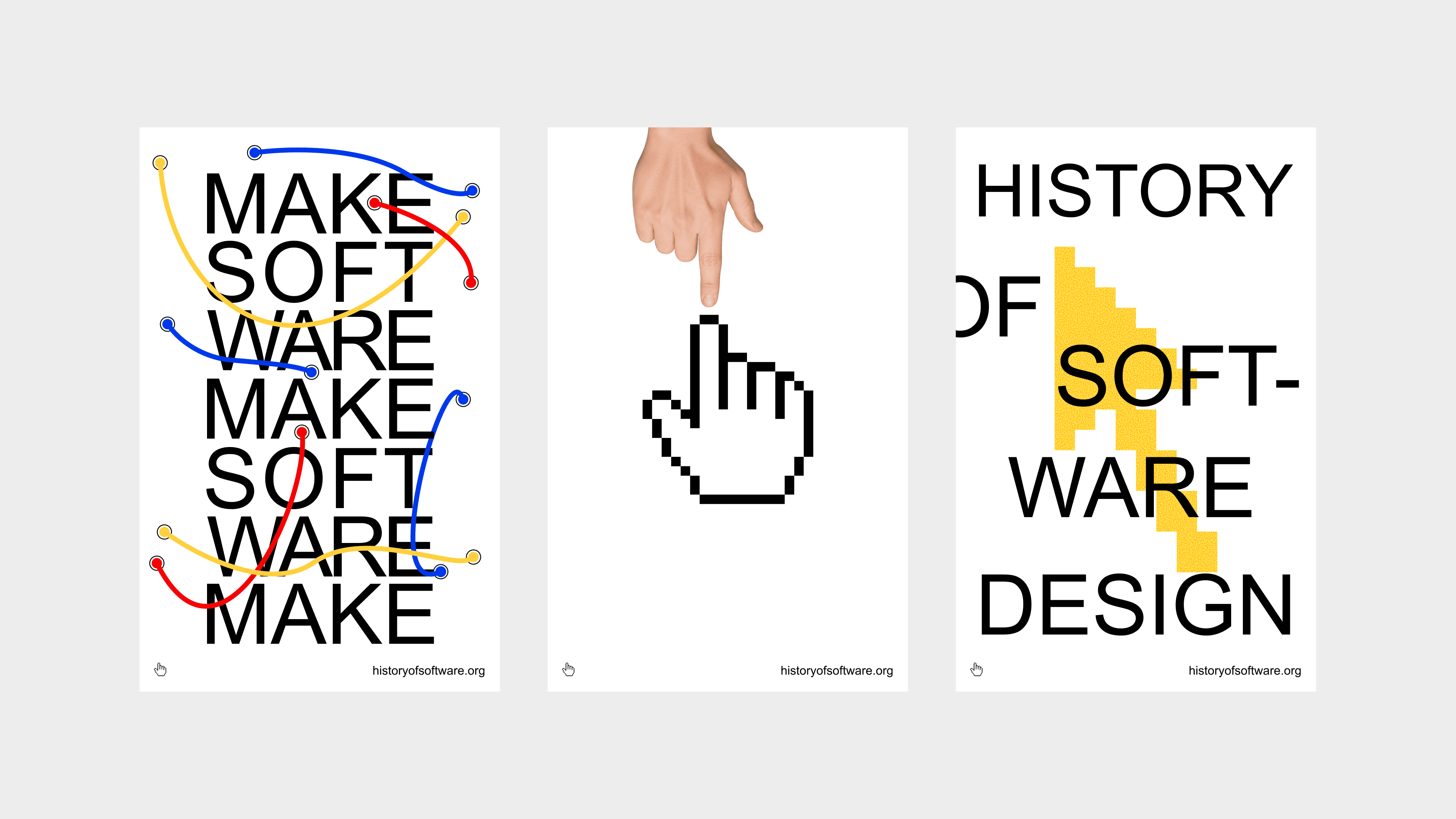
Let's talk about how & why. Bear with me, ugly designs ahead!
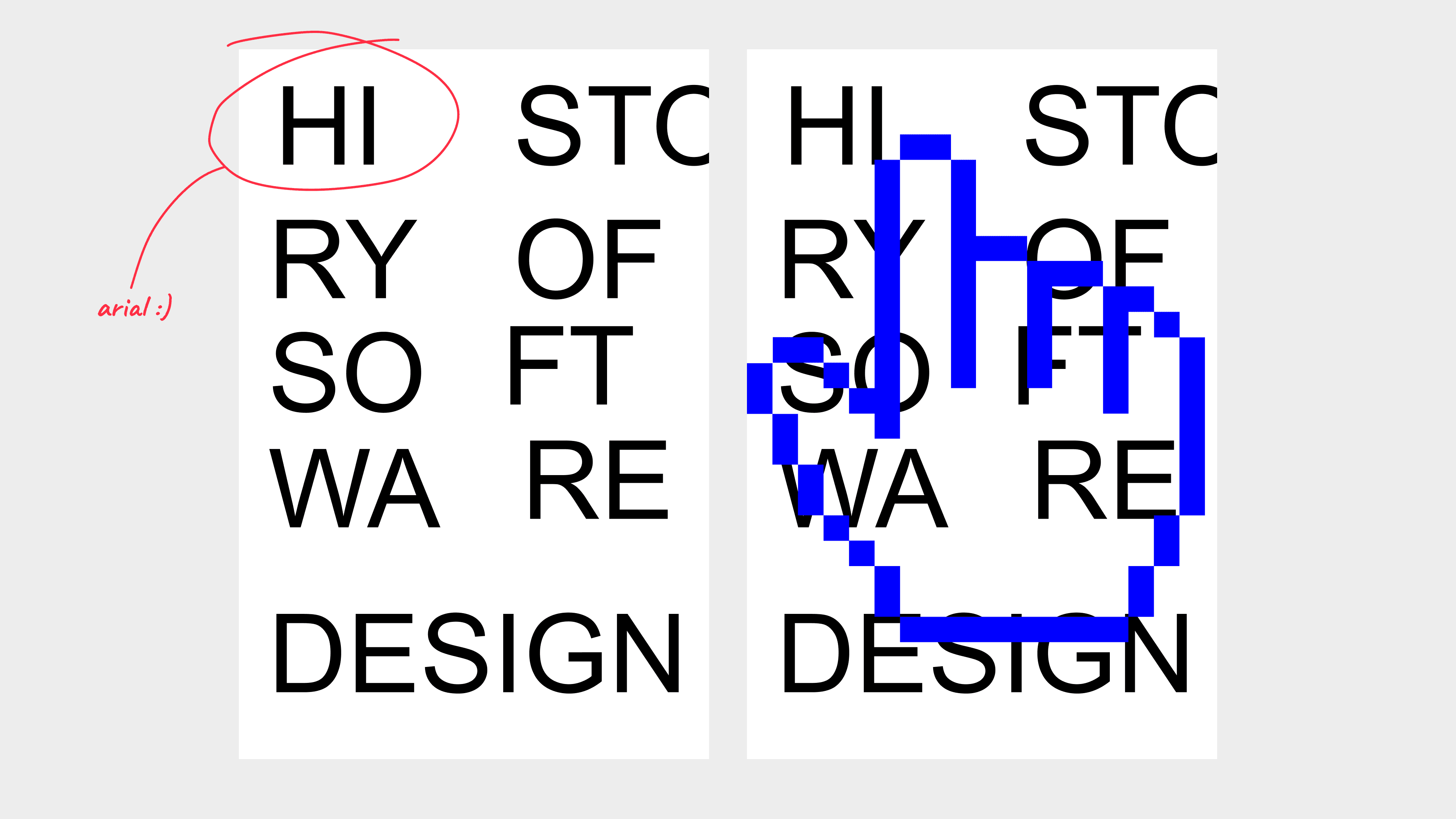
I had no ideas in mind really so I just started playing with typography. I threw the name of the project on a poster in a non-standard layout to see what kind of "shapes of text" I would be working with.
Next, I threw the mark of the project on top just like whatever. And it randomly turned out to look pretty interesting.
Oh and I chose Arial because there's something romantic about a software homage project using iconic system fonts.
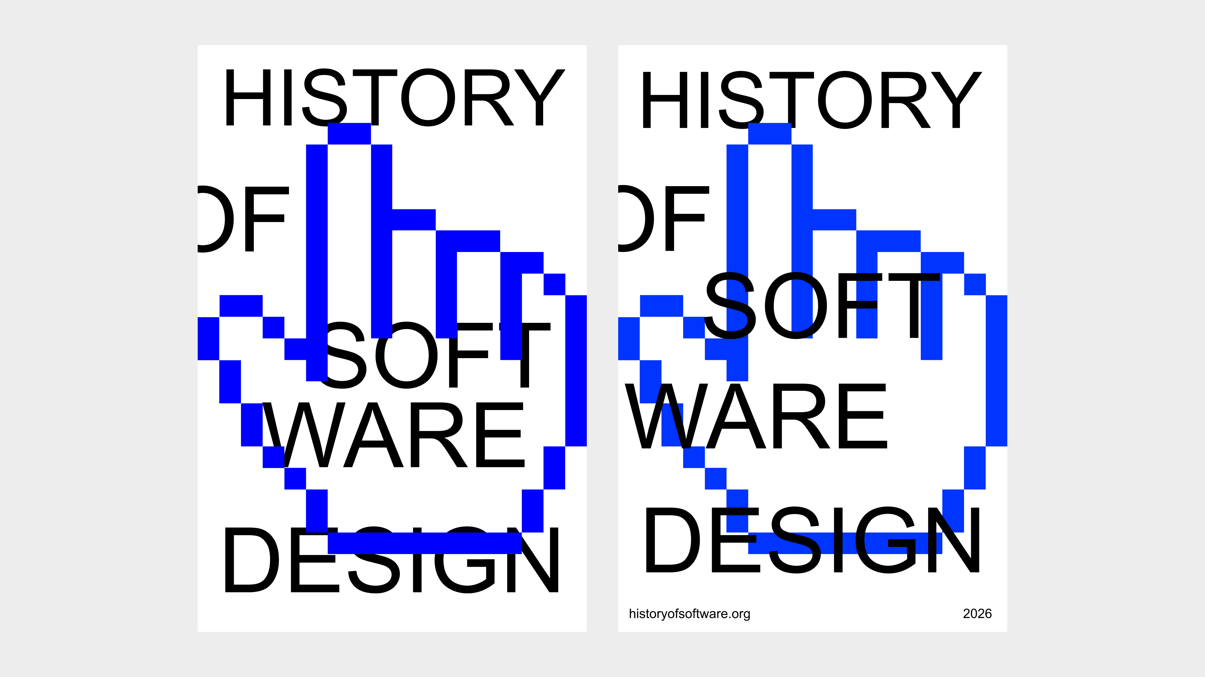
Of course it wasn't very readable, so naturally I made some adjustments and added a footer for some context and more of a postery feel.
Not too bad considering I have no idea what I'm doing at this point.
I had some other cursors I made ages ago so at this point I was trying to see if there was one that works better.
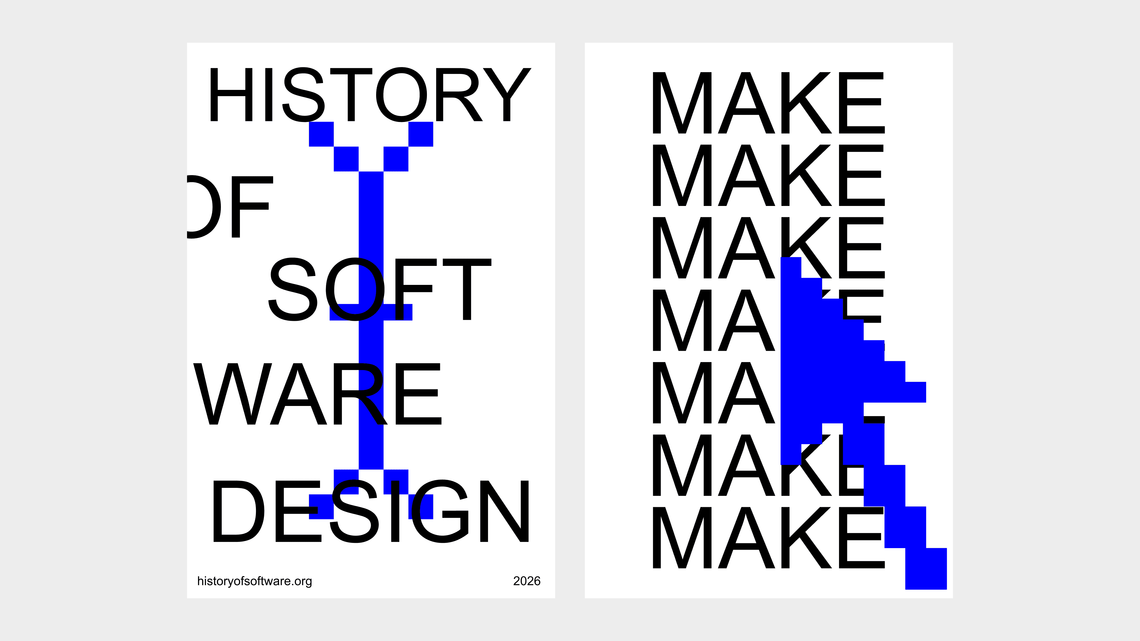
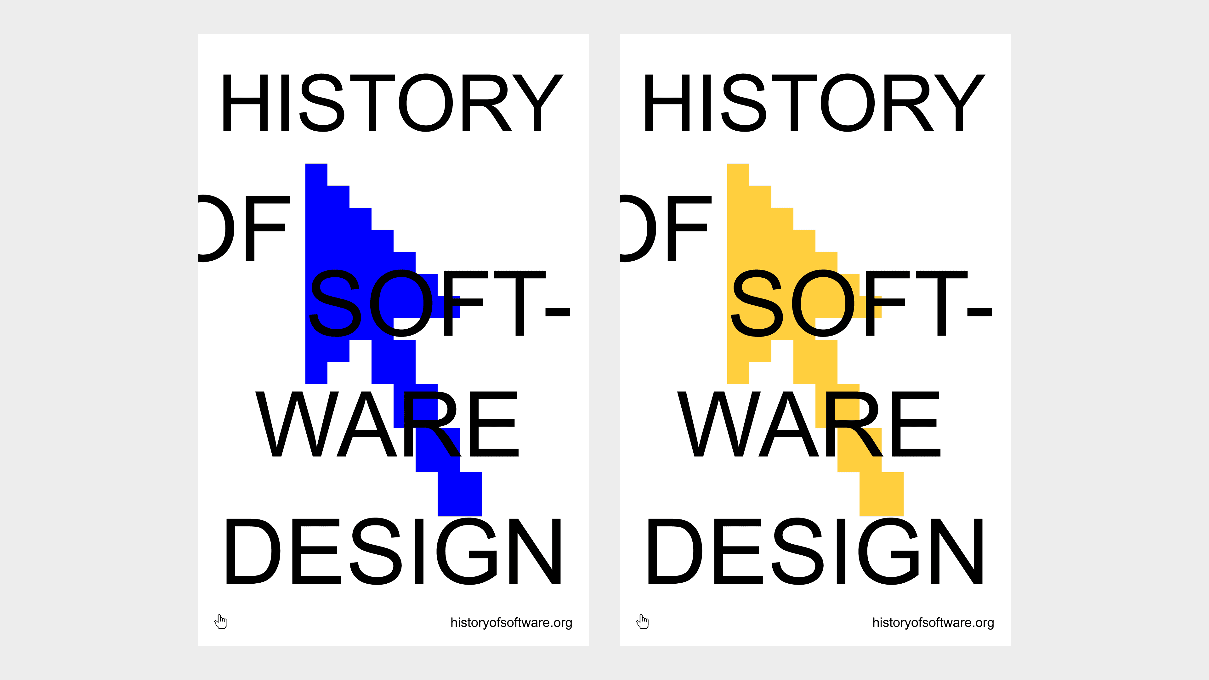
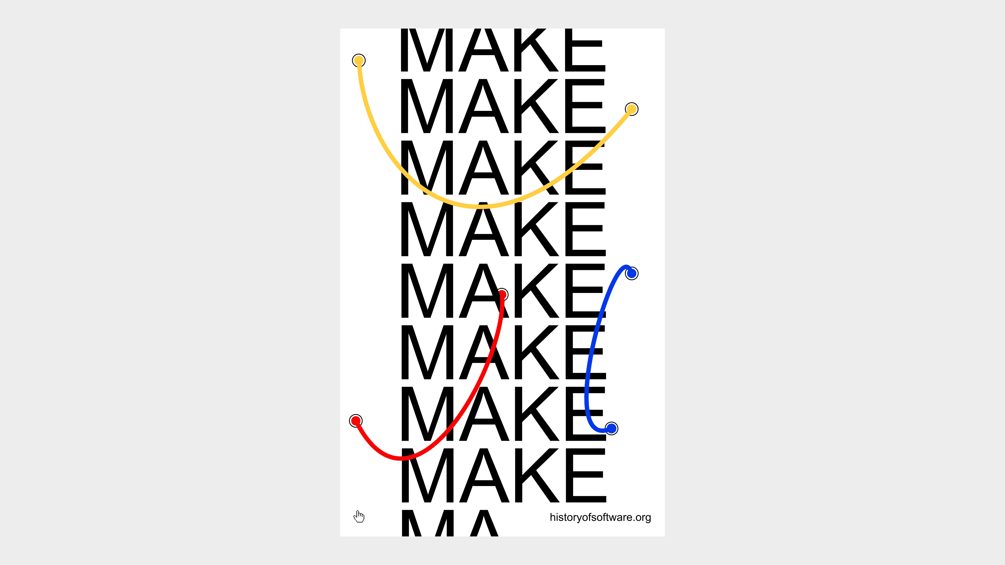
I eventually landed on this layout after moving pieces around.
The blue was not really working here since it was producing poor contrast against text, so I went with yellow.
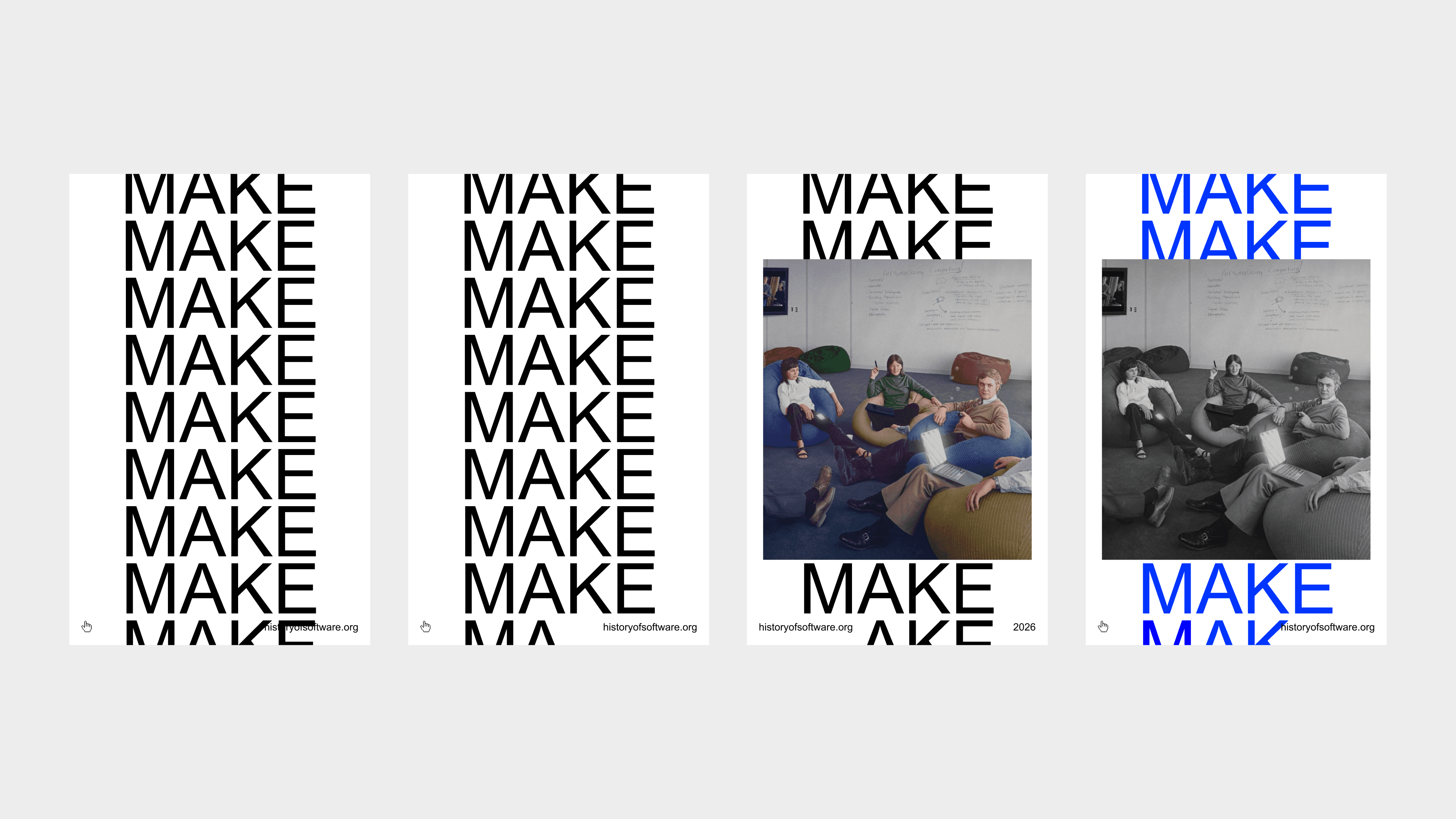
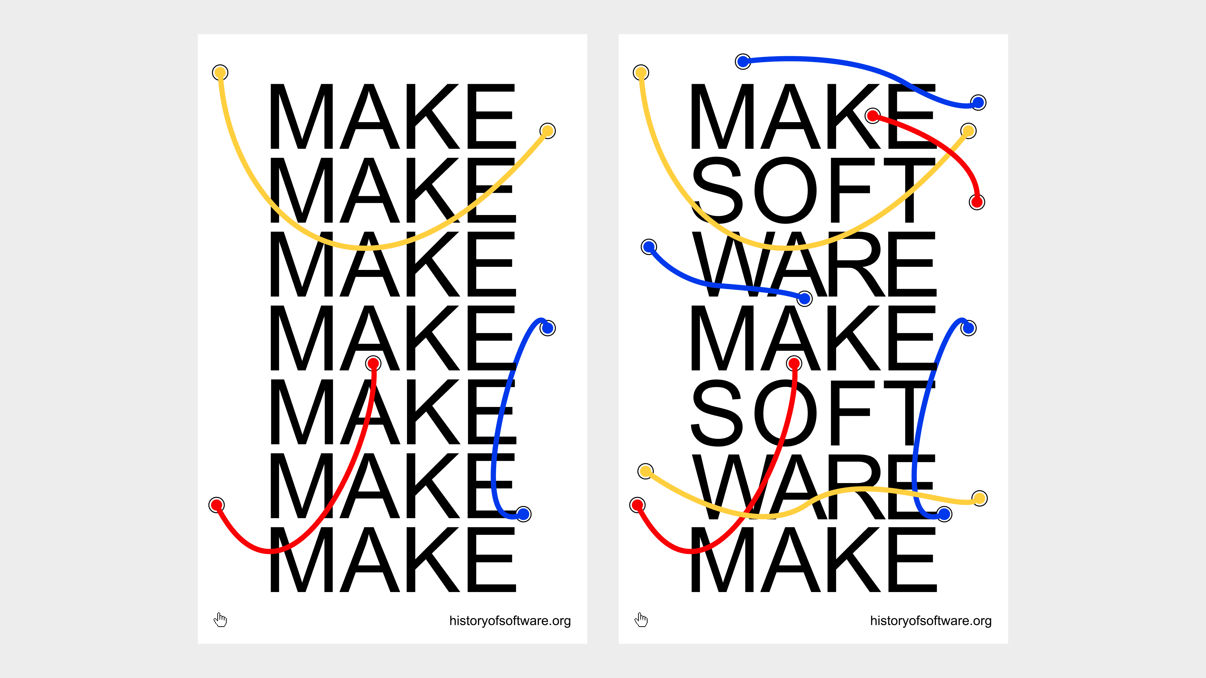
From here I tried another piece of copy from our website: "make software". I couldn't really figure out how to spell "software" with this layout so it was just "makemakemake".
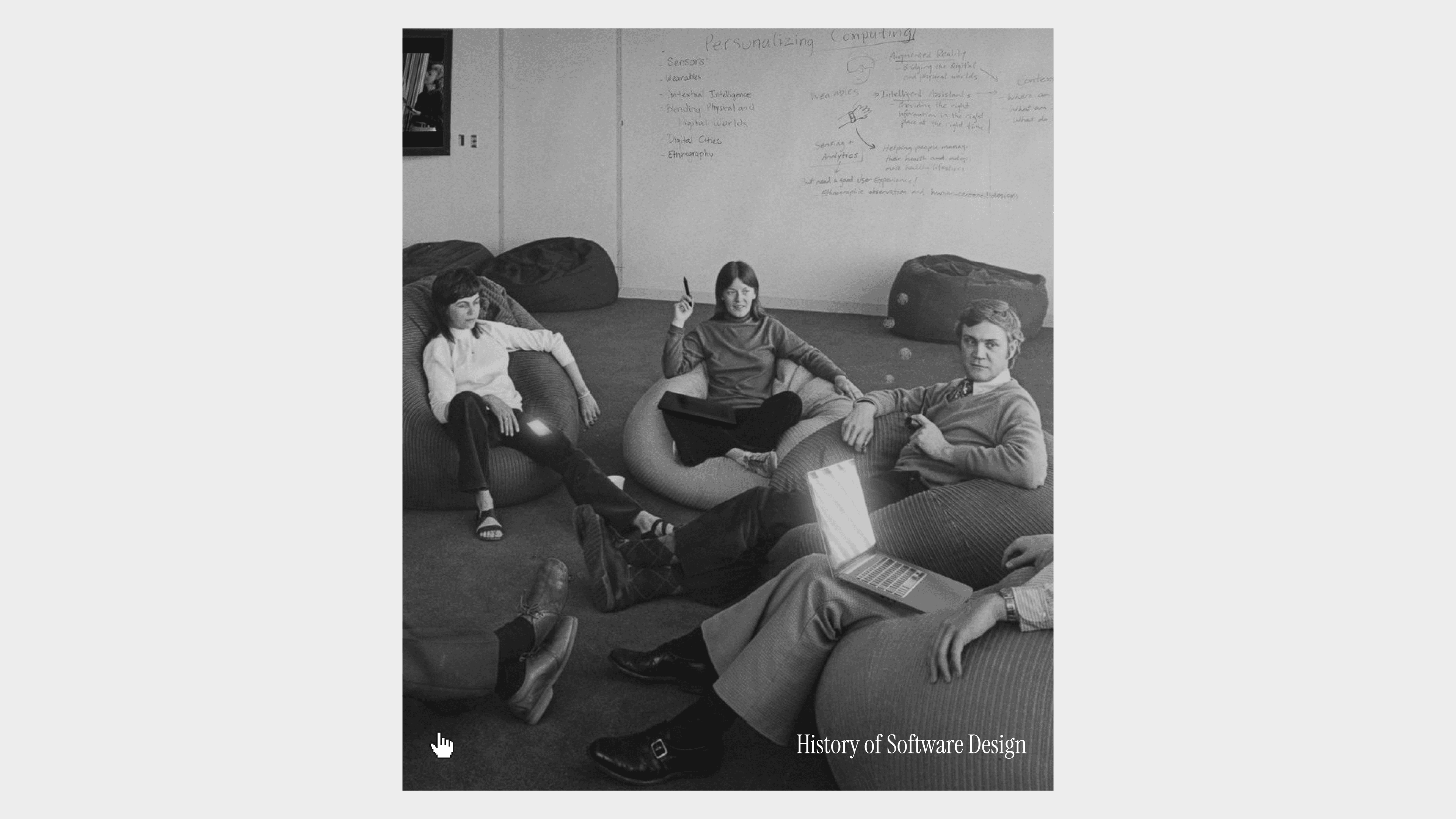
I even tried bringing some imagery in but this just felt really chaotic to me, with color or without.
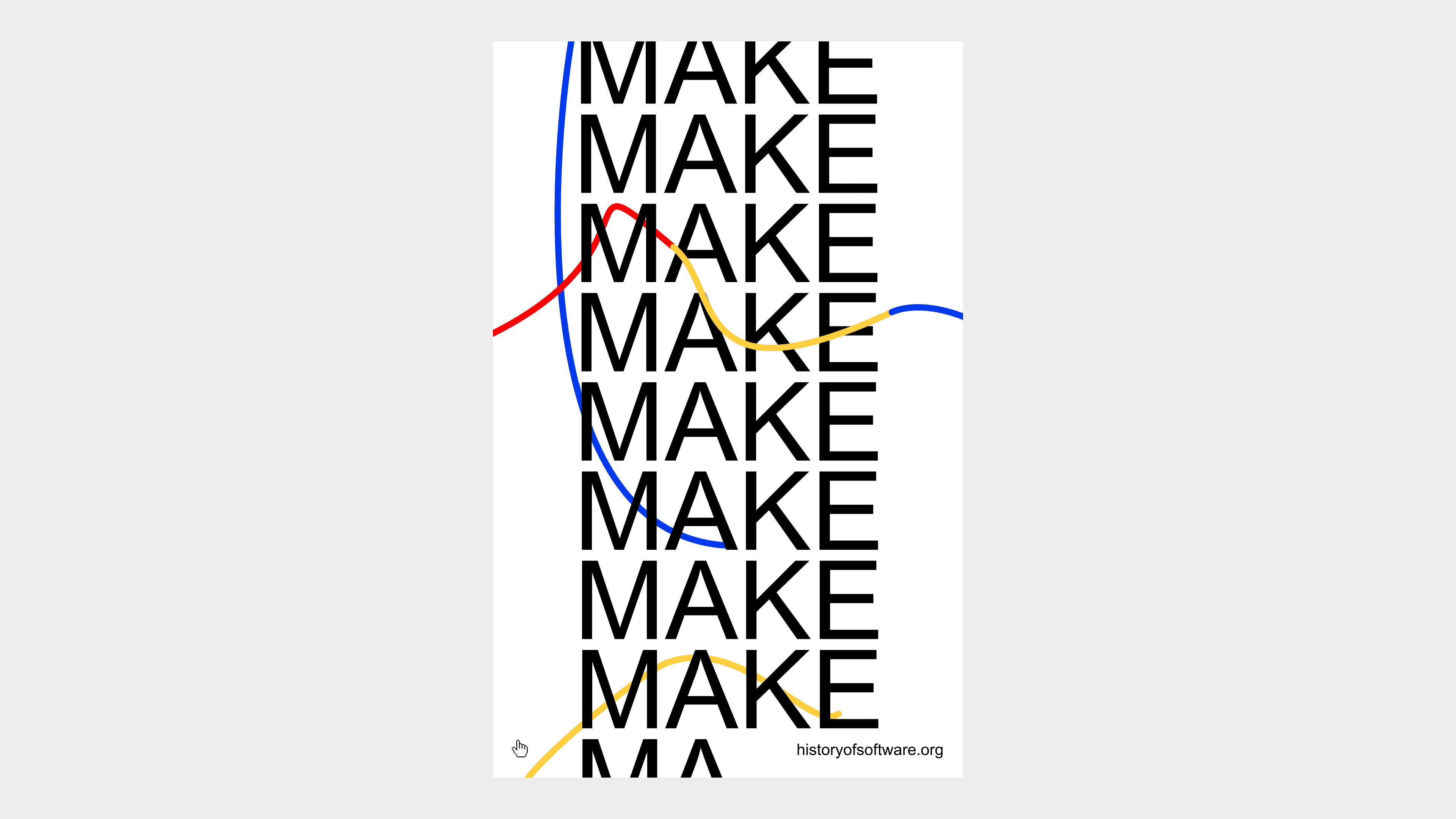
Please don't laugh. I am really bad with the pen tool but I was trying to illustrate the poster with electronic computer wires.
I realised I suck at design so I had to find some reference images.
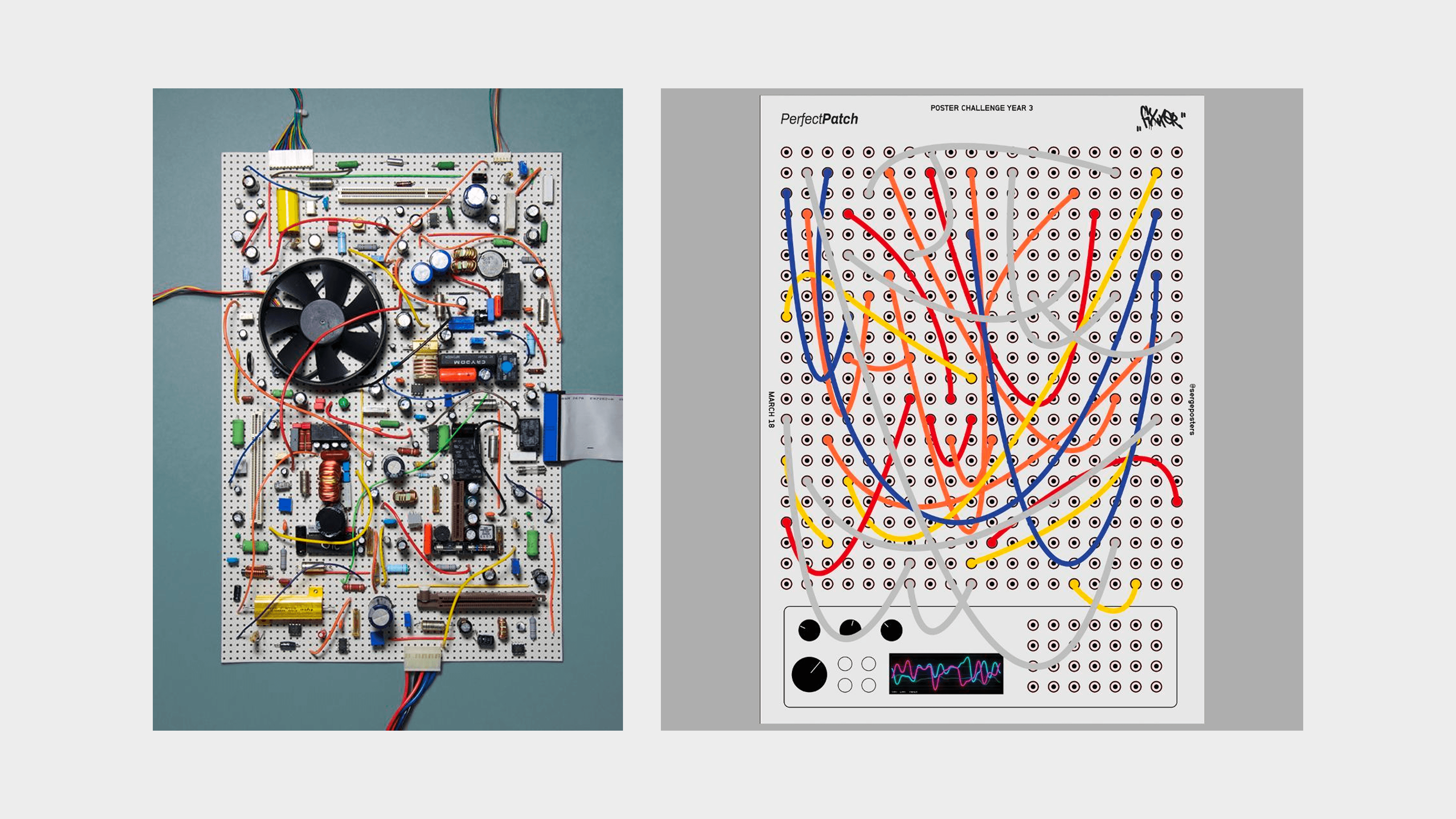
Once I did that the wires looked a lot better.
Now we just needed more wires to balance the composition out, and I finally figured out a way to spell "make software" instead of just repeating "make".
Lost for inspiration I just collected some imagery from Pinterest. I searched for terms like "computer graphics", "computer drawing", "computer poster", etc.
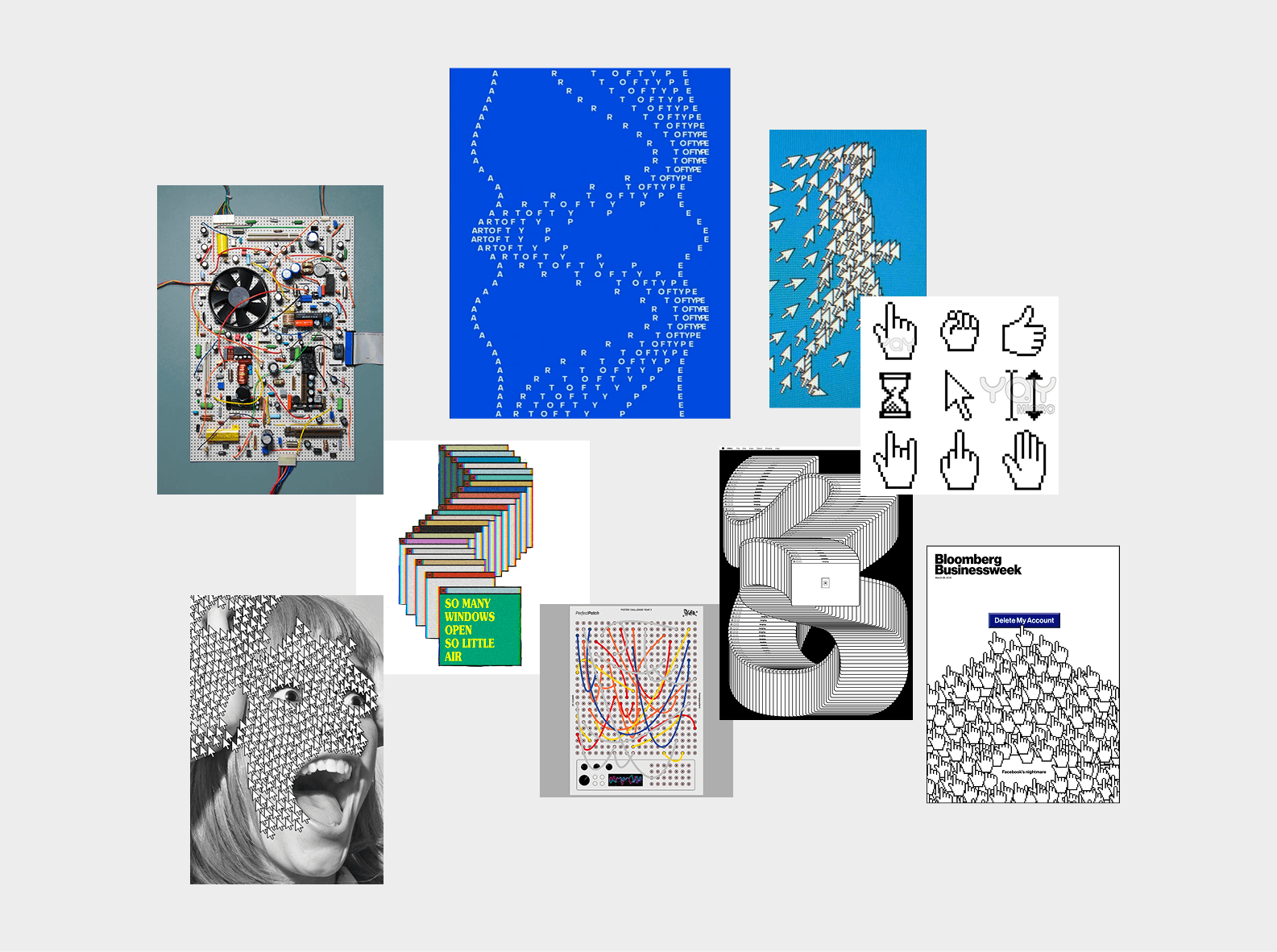
Oh no! It happened again. When I discovered Jacqueline Casey's work I had one of my usual creative existential crisises.
Btw these are from the 1950s... wtf?
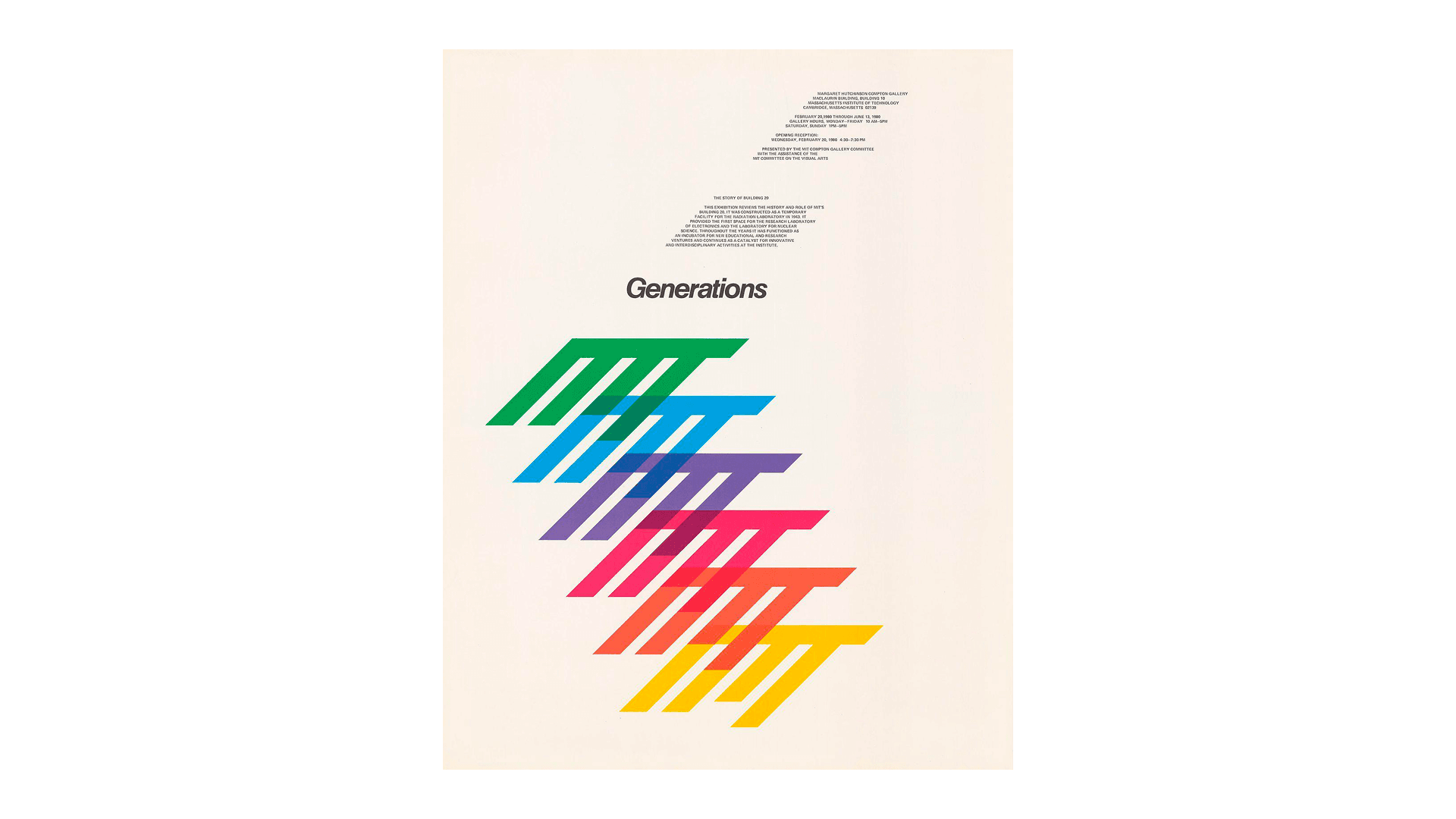
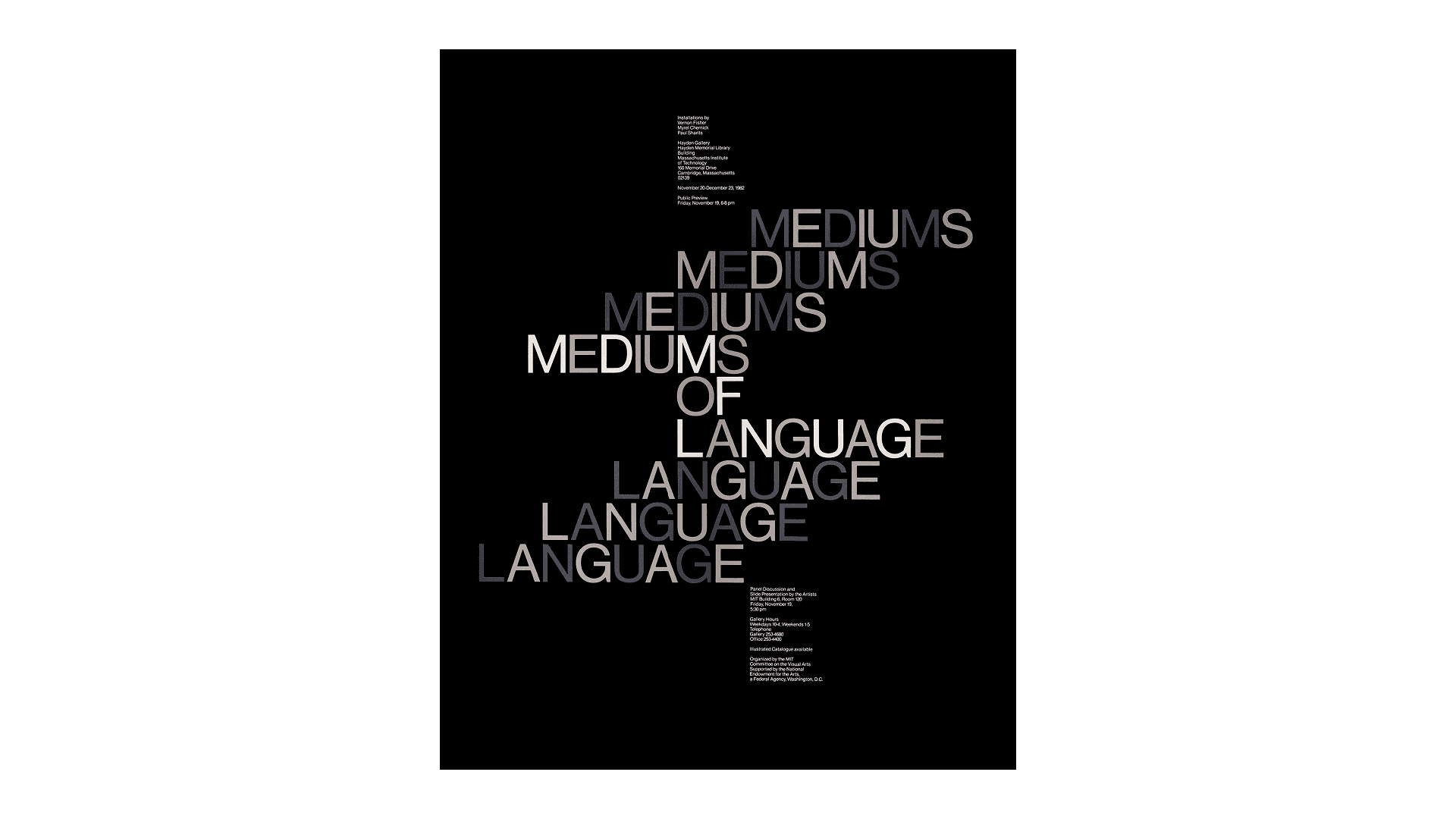
Back to the programme...
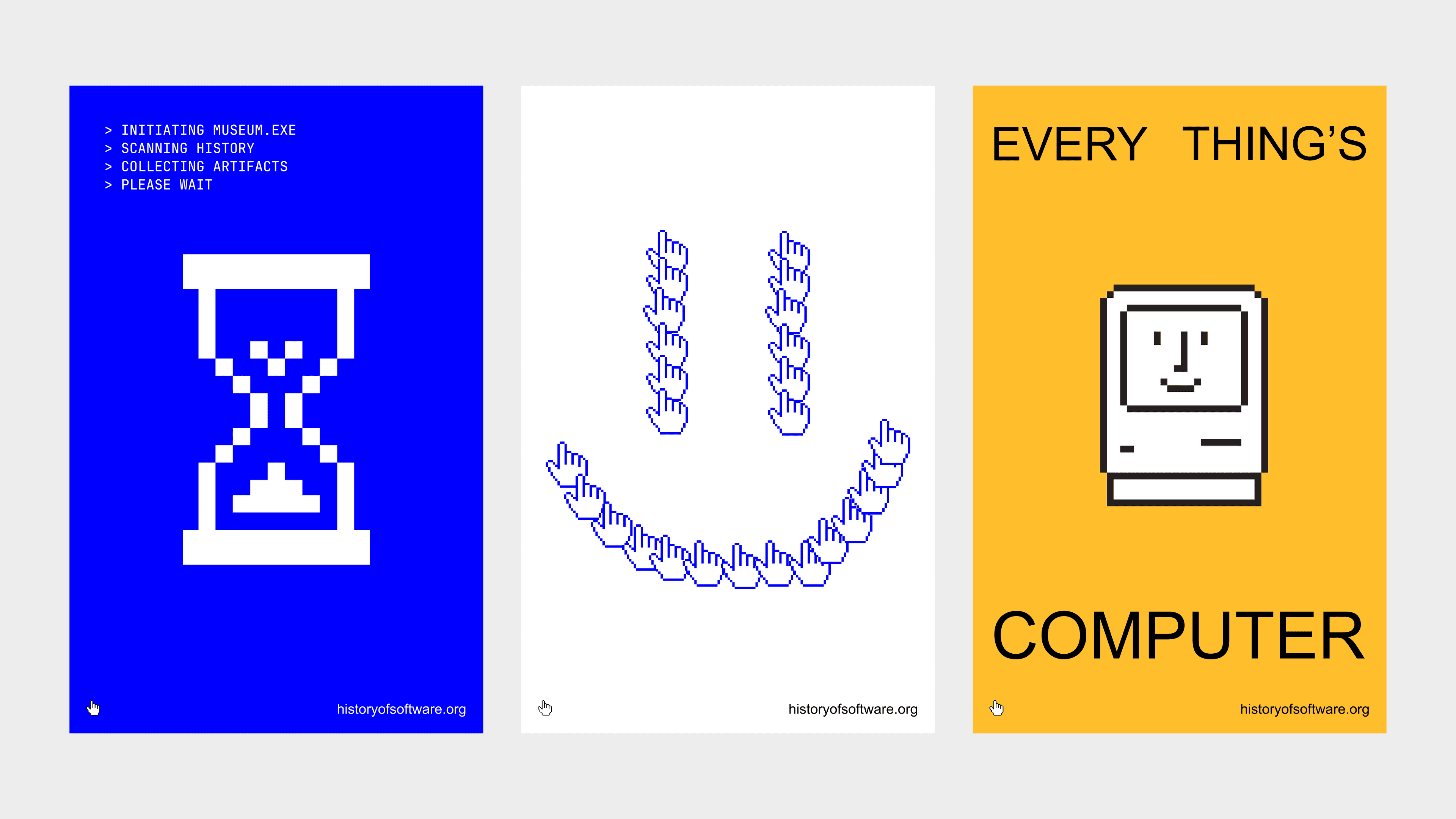
I tried an hourglass and making a =) face with the pointer cursor. Wasn't super happy with these. Hourglass one feels too obvious etc.
Onto the next one, I made this human hand with ChatGPT and tried to use it together with the cursor.
I thought the idea of shaping the human hand with the digital cursor was interesting, but I couldn't make it work.
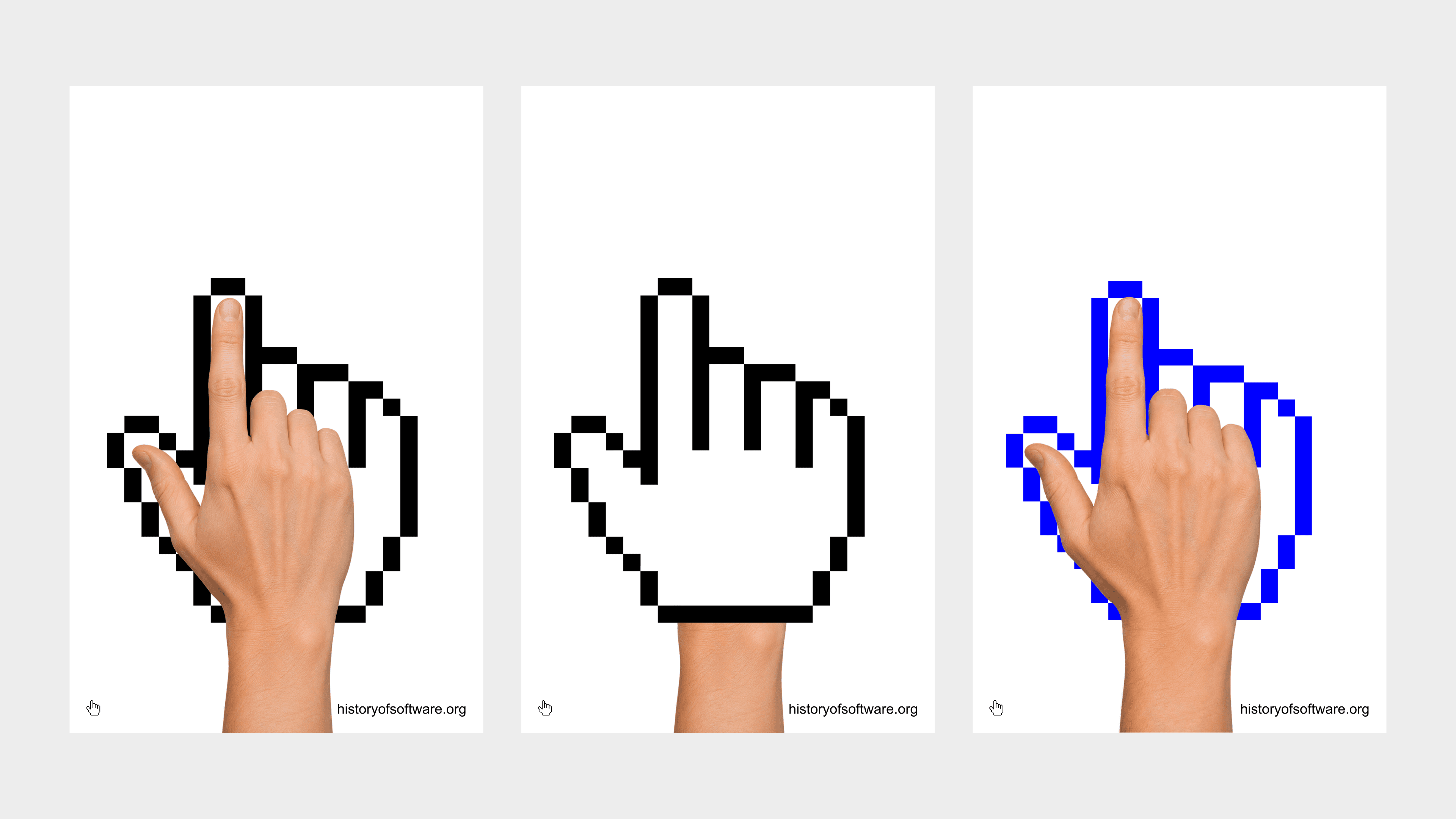
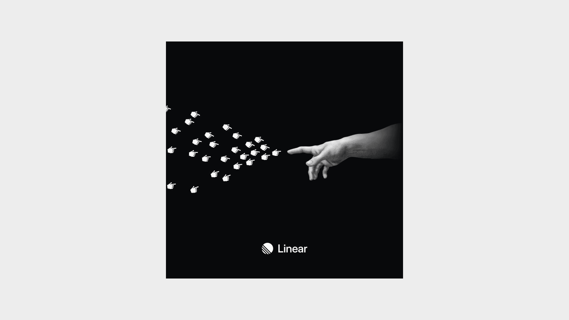
Then I remembered this image from Linear. I thought it was really clever.
I tried so many hand positions its insane. It was tricky to lay out as well because it would always look optically not centered. The hand also seemed to not belong in the scene especially with the blue color.
Nothing felt right until I adjusted the contrast & brightness of the hand!
Looked much better immediately. And now I just centered the mark and made the hand supplementary!
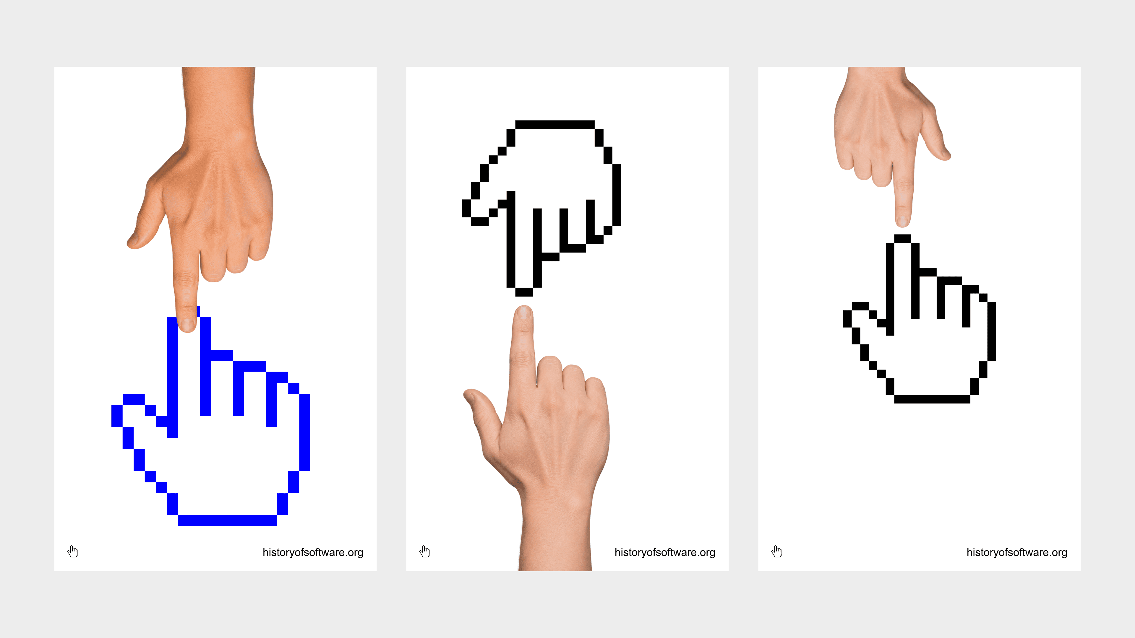
Now, here are all of them together :)