I started another project at Vercel. Jumping into a new surface area is always hard for me. There's so much to absorb and I feel like I don't know anything.
Thankfully the Feature Flags team gave me some good "low hanging fruit" to tackle. Let's dive in.
Like you probably realised, Vercel has a native feature flags system. It does a lot: you can do progressive rollouts, percentage splits, target users, teams, and even custom entities.
For now, we wanted to re-design a single tab—Entities. Here's a quick before & after if you're not interested in reading my rambling:
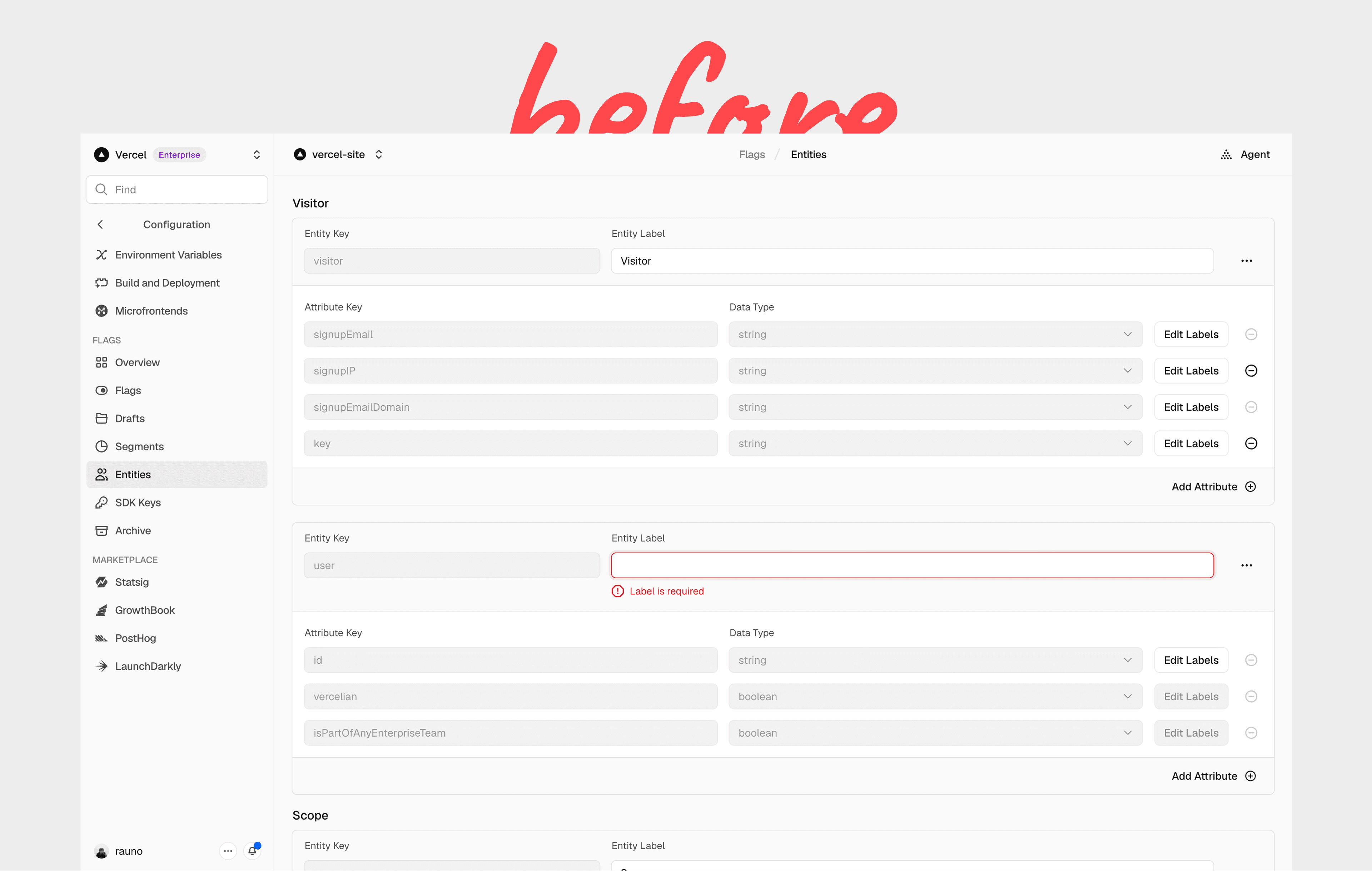
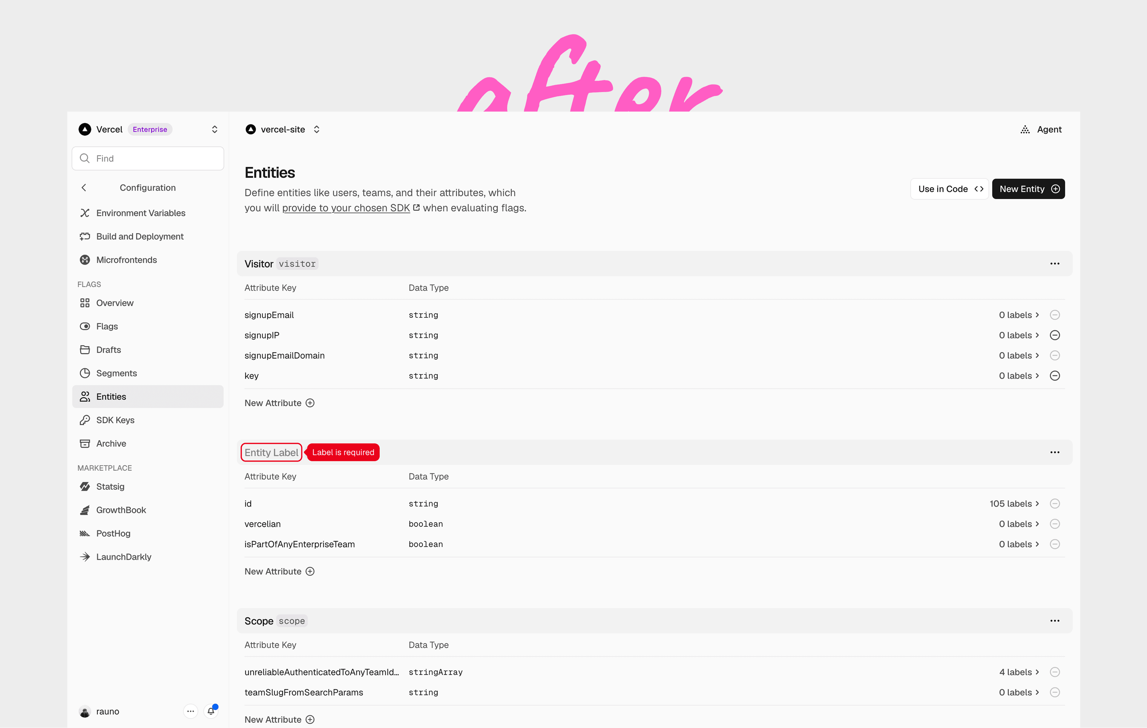
A little about process: we didn't have these designs in Figma so I pulled out the "Linear Method" and captured screenshots of the app and glued them together in Figma:
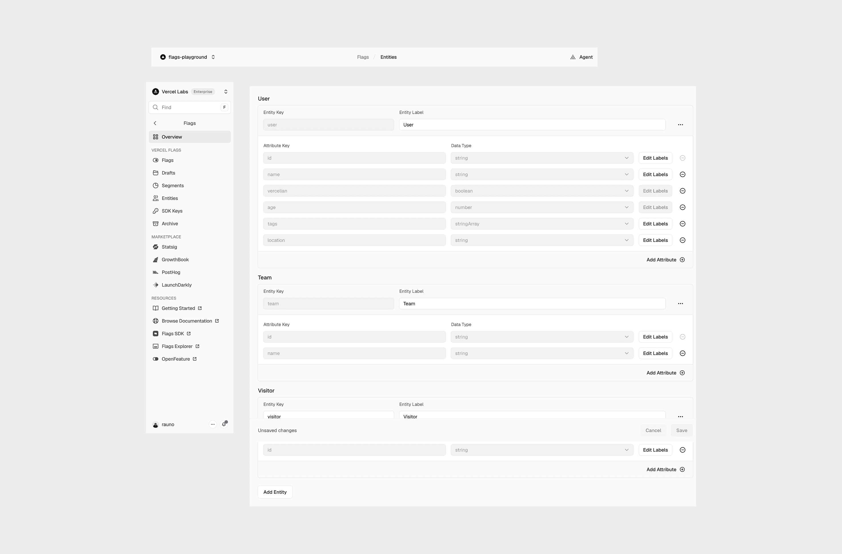
At this point you might be like—Rauno?! Why not just work in code or mock them up in Figma. Well, I didn't want to jump into code so early. It wouldn't let me explore a bunch of different ideas quickly. Changing direction from a GUI is still way faster than prompting an agent.
And since I didn't need to make any changes for the sidebar or header I didn't want to waste time on them. Also rough approximations would not work for me. I would just get lost in making sure everything feels production-like. I don't like when a mockup looks "almost like the real thing". It should look exactly like production, including real data and states.
We wanted to provide more context for the page. Like, “Entities” is a very vague term. And we were also convinced that people do not know that you need to also pass context through the SDK for Entities to work.
So I was playing with different header treatments. It was mostly about just finding a length of copy that looks reasonable on the page.


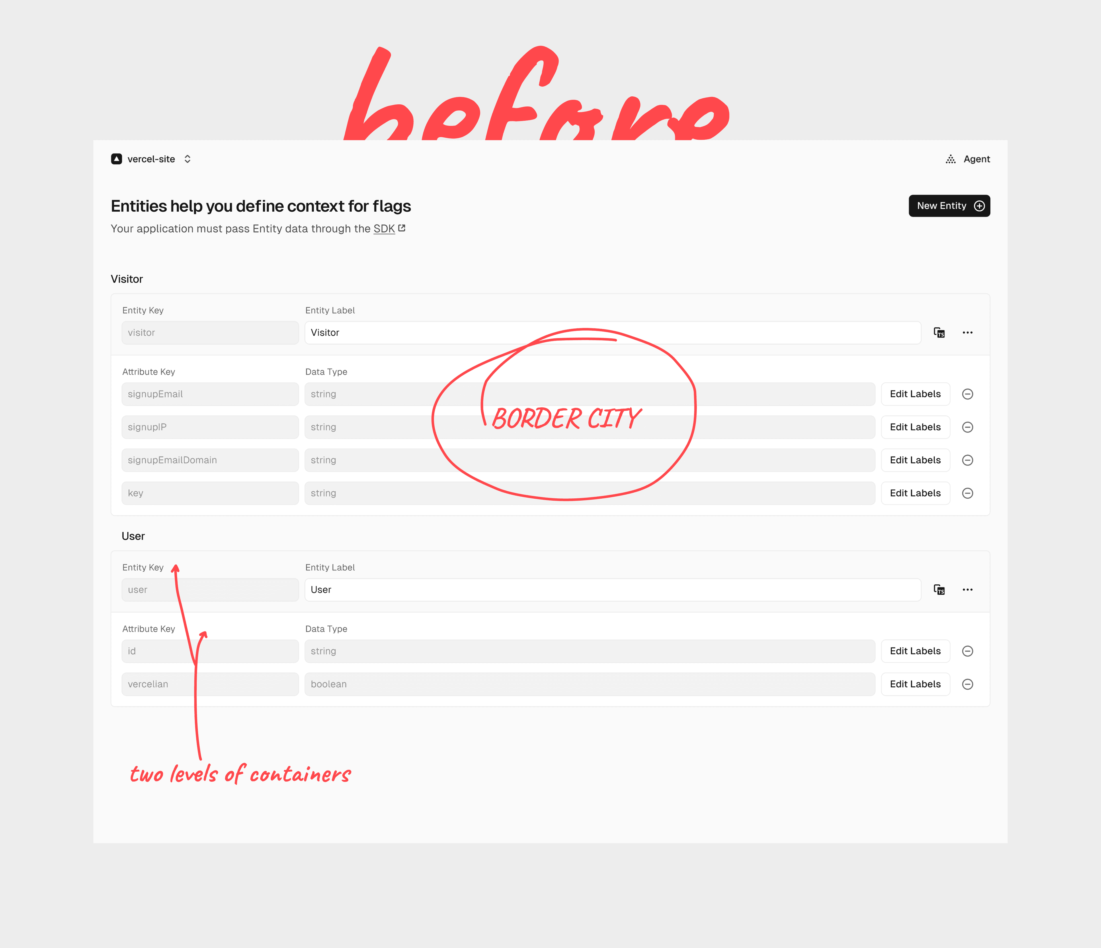
I ended up with a two row header, and at this point one my main issues with this page is that its very border heavy, and its hard to distinguish between sections because everything kinda blends together.
So I just killed the outer container and made the entity key and label into a section header, and we use ghost inputs for them.
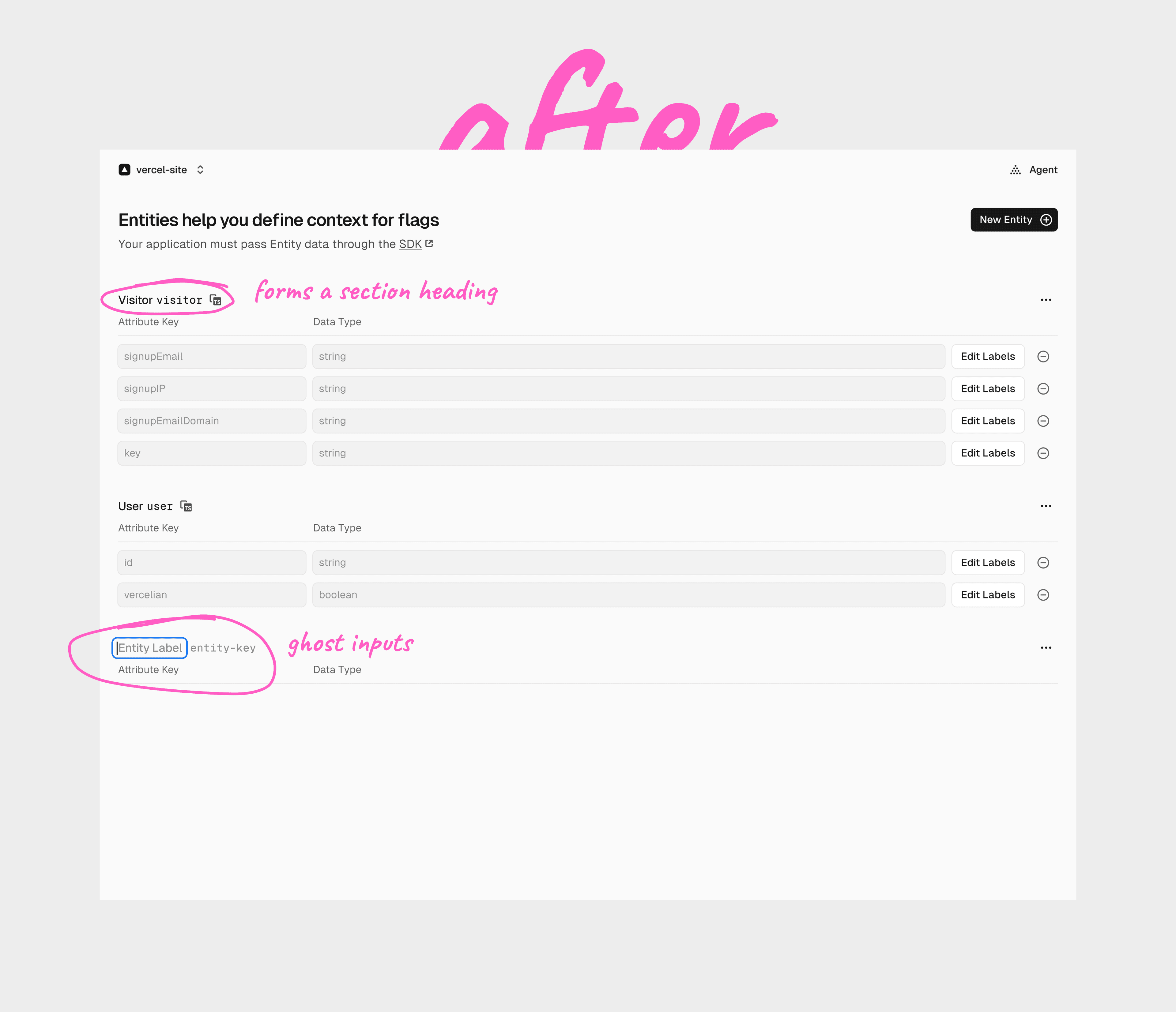
Next I realised that the fields become static after creation. You can't edit them. So we decided to drop the inputs to have a cleaner, table-like interface.
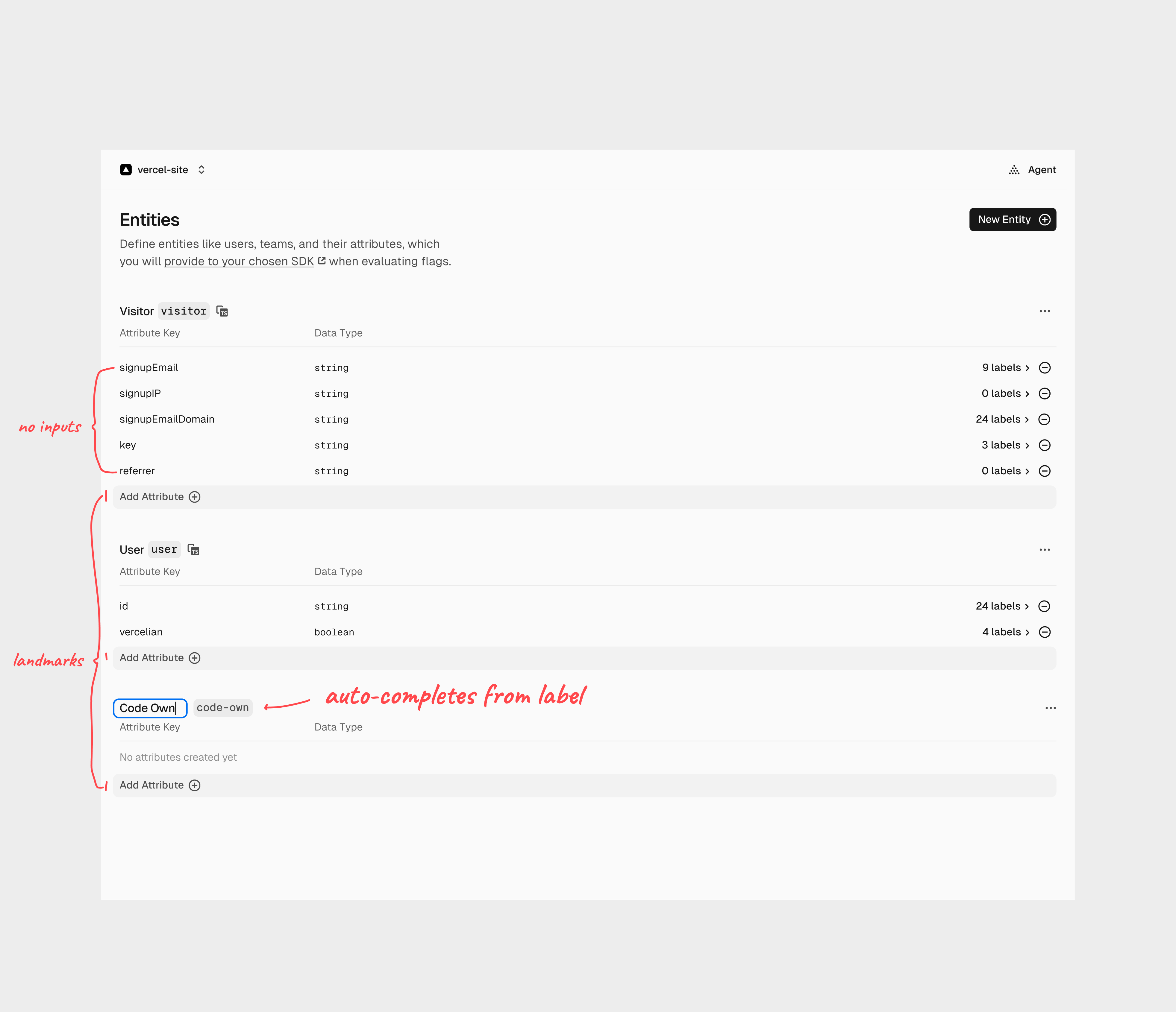
If we wanted to make other fields editable, we could also use ghost inputs.
And tbh I'm not really concerned with affordance here because one learns how to work with these bespoke text fields when creating their first Entity.
Obviously, we scroll the input into view. But interestingly, we actually don't have enough padding at the bottom of the screen since the newly created entity is at the end of the page, duh.
So we temporarily increase the page height to be able to center the newly created entity input on the screen.
Otherwise you would just be very confused :-)
At one point I moved to implementing the designs. We of course made some tiny changes in production.
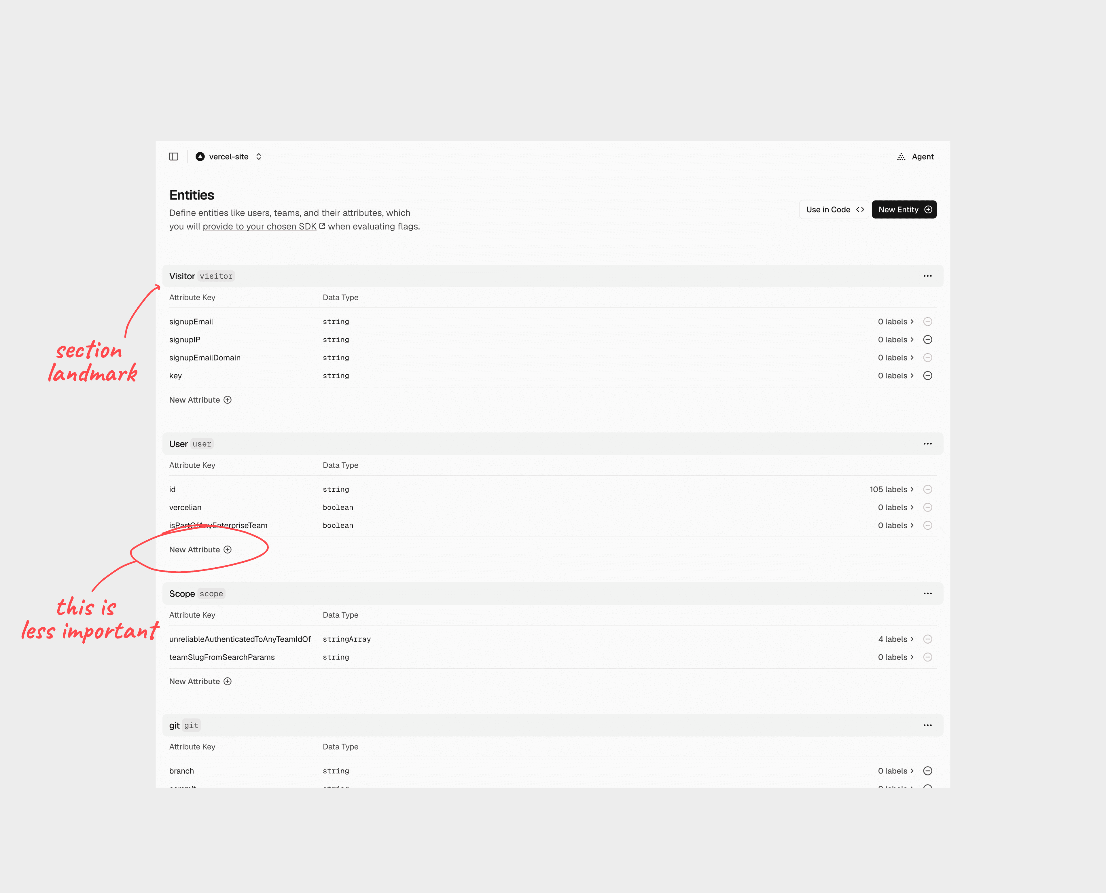
Like someone seeing this with fresh eyes immediately noticed that we are highlighting the wrong thing.
If we throw the gray highlight on top of the section header it becomes so much easier to scan and jump between sections. Small things matter.
Finally, here's how the ghost inputs work in tandem. They have to nudge each other when focused since the focus ring gives lots of breathing room to the input itself:
For errors, we render a red tooltip around the field: