Our dashboard at Vercel has a sidebar. All kinds of important notices or promotions live on the sidebar surface. There can often be many of them, so there needs to be a way to navigate through several cards.
The sidebar doesn't give us a lot of space to work with. The main problem to solve in this area is placement of controls. It is important to do this right because you see the sidebar all the time, and if this interaction sucks, you will think that Vercel sucks.
As you can see from the iterations below from Nathan (there are dozens more), it is impossible to place arrow controls some place reasonable. They just don't look good anywhere without feeling disconnected or awkwardly positioned.
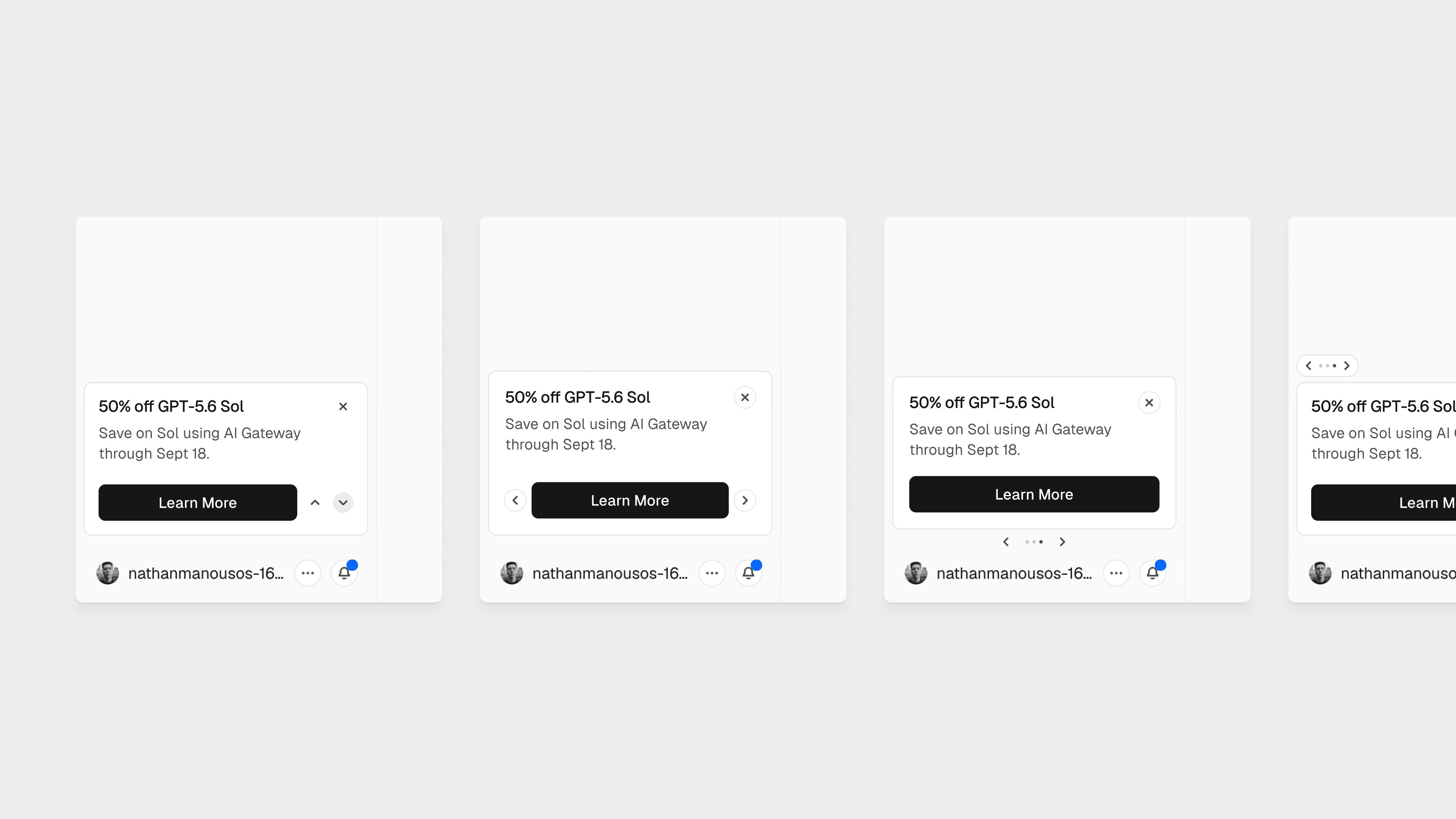
Having to coexist with the cross (dismiss button) makes this a nightmare on another level.
I had at least 50 iterations of my own. I forgot most of them and the code is long gone so you'll have to settle for only a few points of interest.
First, I tried playing tetris with the controls myself. Didn't get very far. The only thing I knew was that the cross seemed to be in a reasonable location in the top right.
So let's just drop the other controls. But how do we navigate?
My solution involves stacking the cards. The cards are the controls.
Hovering the main card subtly pulls up the next card as a hint. This makes it more obvious that yes, this area is also interactive.
Once on the card, you may be tempted by the motion to explore another.
Hovering the peeking card shows you its title.
Notice how the hovered card doesn't return to its "hint state" where it was subtly pulled up? You've already understood this area to be interactive, so there's no need to nudge you with it anymore.
Naturally, pressing the card makes it the active card.
I didn't see it making sense to have both peeking cards interactive. There's no way you could reasonably have any particular interest in a blank, context-less card. So pressing this area moves one card at a time.
The hit area is also pretty generous thanks to an invisible, padded element. Notice how I can hover the card further back and still receive a response.
To painfully drive it home, here's how it would feel without the invisible hit area.
You have to be annoyingly precise.
Again, here's how the interaction works in full.
You can even comfortably move through all the cards without having to move your mouse between cycles.
By the way, at some point there was a bottom stack.
I found this cool because it gave a good sense of where you are in the stack.
But as you can probably realise, the proximity of the primary action and the bottom stack made me feel a bit uneasy about this strategy. It felt anxious to be precise with your mouse.
Next, I want you to appreciate how non-obvious it is how to smoothly crossfade between stacked cards.
Here's what I had in one of my earlier iterations. I would just swap the Z-index during the transition. Super janky.

We don't need both to crossfade. We just need the exiting card to fade away.
After which it teleports to the end of the queue after fading out.
Finally, let's talk about the dismiss button. We actually had some trouble here.
It might not be obvious that the dismiss button dismisses all of the cards. Think of it as the "I don't want to see these at all" action.
How do we communicate that it doesn't just dismiss one card but all of them?
Due to space constraints a label is not really going to work in case the card title is very long. And sure, we could do a tooltip but tooltips kinda mean we failed as designers, you know?
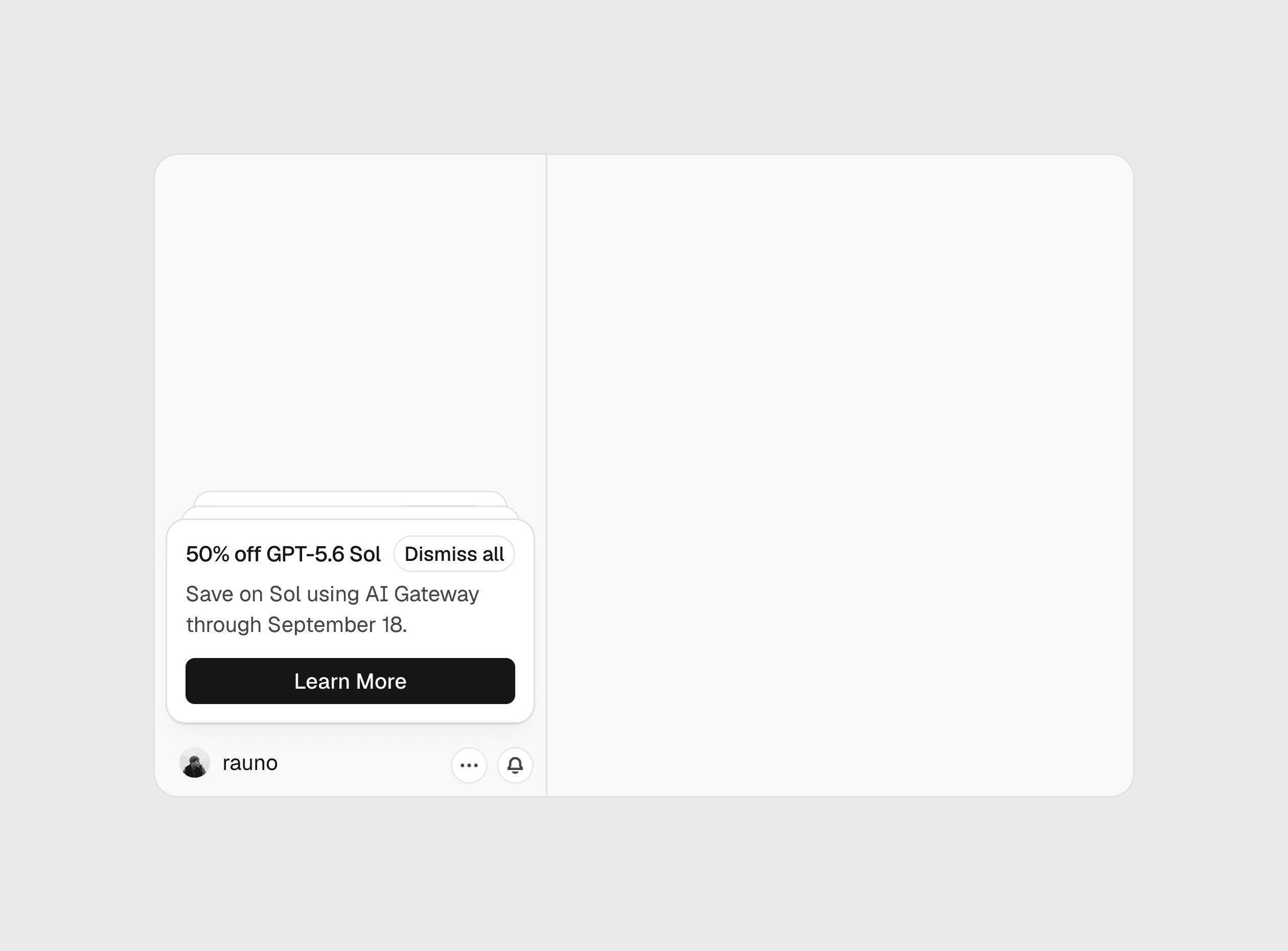
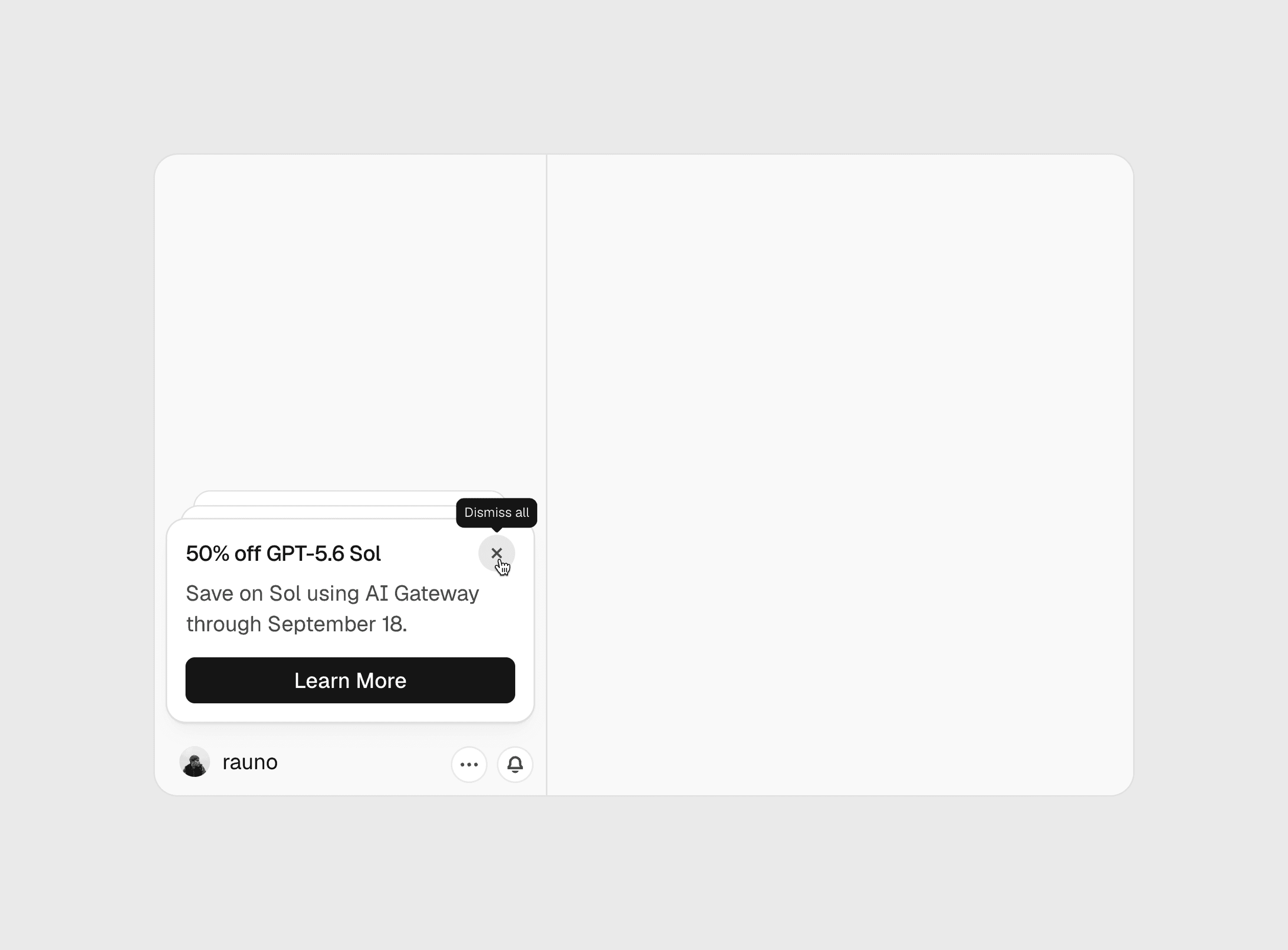
My solution, albeit controversial, is to use motion.
First, on hovering the dismiss button we collapse the peeking cards. This signals that the dismiss action relates to all of them.
Next, we scale down the active card. I would have loved to move it down towards the exit direction but I found this to be jarring since your trigger shifts from underneath the pointer.
Scaling down = shrinking = dismissing, close enough.
As a bonus, here's an exit animation that I had fun with but eventually decided to drop.
Anyway, here's the final final version. Bye!